
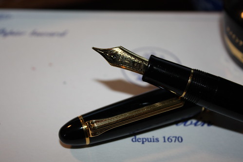
The next pen to check all the boxes on my list, was the Sailor 1911L in black and gold. This kind of flies in the face of so many other sites, who call the classic cigar shape, especially in black and gold, boring. There are those who prefer the cut-off, flattened finials, with the Sailor logo on one end, and the barrel’s ink viewing window (on the Sailor Pro Gear).
I don’t.
I don’t like the shape of the Pro Gear—it’s a great pen, but I prefer the shape of the 1911L, with the rounded finials at both ends. I also think that bright orange, yellow, or cloud blue, should remain ink colors, and not make a beautiful pen look like a cheap, fairground prize, that you might win for tossing a ring around the neck of a rubber duck. And I prefer cartridges, converters, and eyedropper/syringe-filled pens to piston/vacuum only fillers. The classic shape of the Sailor 1911L is pure, understated style, and the black and gold is elegance in a precision-engineered, writing tool.
And I’m not entirely alone in appreciating the appeal of classic design…
This fountain pen adds to their reputation as a smooth writer with its 21K gold nib and incredibly smooth writing experience. There just aren’t the appropriate adjectives to describe the smooth-as-silk experience here…
It’s classy design, exquisite feel, gorgeous 21K nib, it’s a stunner, but it’s a stunner that holds its own in the performance department.
Jennifer, May 19, 2013—
Sailor 1911L Fountain Pen Review
Although, Rodger of Penclassics in New Zealand, reviewed the 1911L in a sort of canary yellow (really)…
As soon as you pick it up, you’re aware that it’s a quality writing instrument, every little detail of the pen is superb, hard to describe without handling one…
Rodger
Penclassics—The Write Pen
Whatever your preference may be, I think we can all agree on what amazing pens the Sailor 1911 range are, and this is the one I picked up:

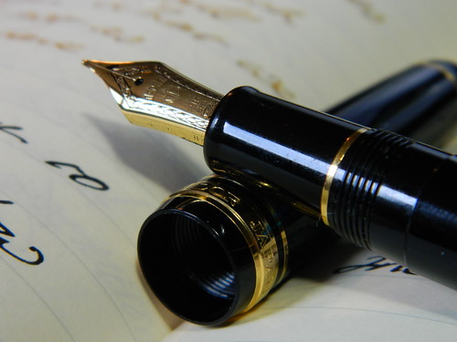
The 1911L is a fraction larger than the Platinum 3776 Century uncapped (122.5mm vs. 119.mm), so despite the name, it’s not a large pen by any means. It can be posted, but is just as comfortable in the hand without attaching the cap. The barrel and cap screw together to form a nice, tight seal, and in all my time of ownership, I have never had a dry start or a problem with ink flow.
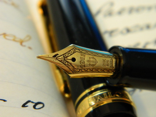
But it’s the nib, as Sailor is renowned for, where the true beauty, and key to the performance of the pen, are to be found.
I filled this pen with J. Herbin’s Perle Noire for this review, and finally got round to touching nib to paper.
Writing
If you look closely at that amazing nib, you’ll notice something about the tines—they look slightly twisted.

Look closer…
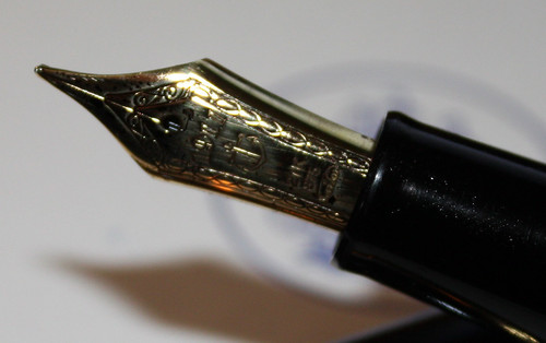
Trust me, they’re fine, really. It’s just my lousy photography, and the slightly turned angle of the pen that makes them look like that. They were actually perfect, straight out of the box. If they were as damaged as they look, then they would never have produced this:
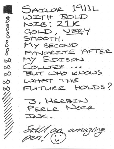
The pen writes faultlessly, and flows across the page smoother than ice on glass. It is truly an amazing writing experience, that you just don’t get with many other pens.
Yet, somehow it just couldn’t quite beat out the Edison Collier’s steel 1.1mm stub for sheer fun to write with; and of course, the stub always makes my scrappy handwriting look a bit more interesting.
Details
Quite why the 1911L is called the Large, I’m not sure. It’s certainly larger than the Sailor 1911 Standard, but even then, only by a few millimeters. The table below provides dimensions in metric and US units.
|
Metric (mm/g/ml) |
US (in/oz) |
|
| Length Unposted: |
122.5 |
4.8 |
| Length Capped: |
139.7 |
5.5 |
| Diameter: |
12.7 |
0.5 |
|
Length Posted: |
152.4 |
6.0 |
| Weight: |
23.7 |
0.80 |
| Nib Size: |
B |
B |
| Nib Material: |
21K Gold |
21K Gold |
| Cartridge Notes: |
0.9 |
0.03 |
| Converter Notes: |
0.5 |
0.02 |
Given the size of the Sailor, and my preference for larger pens, that’s another reason for the Edison Collier to remain top of my carry list… but the Sailor is a close second. In fact, the two sit side-by-side in a two pen carry case that goes with me pretty much everywhere.
Summary
The Sailor 1911L embodies style and elegance in its design; the 21K gold nib is nothing short of stunning in use and appearance. Unposted, the pen is a little short for my taste, but even that isn’t really a problem. My only problem, is that I prefer my Edison Collier and the 1.1mm stub, and that’s just personal preference. All the same, the Sailor is still a close-run second place. Personally, I think every fountain pen enthusiast should own at least one of the Sailor 1911 pens. If you’re in eastern Ontario, and anywhere Toronto, call in to Take Note, or Wonder Pens, and ask to try one out (but maybe phone first to check they’re in stock—these are beautiful pens, and very popular).

Pingback: The Carry I – Writing
Pingback: Jinhao 605 – Writing
Pingback: Writing Practice – Writing
Pingback: What Am I Still Using? 2018 – Writing
Pingback: Sailor Pro Gear Slim (Sapporo) Special Edition Earth – Writing
Pingback: A Nibmeister Adjustment—Yes or No? – Writing
Pingback: Waterman Carène in Marine Amber… That’s It, I Need No More Pens – Writing