
I have been lucky enough to have had—for some while now—a few fountain pens that are both beautiful to look at, and a truly beautiful writing experience. My favorite in both of these categories is, by the slimmest of margins, my Edison Collier in Burnished Gold, with a 1.1mm steel stub nib that I smoothed myself (stupid, stupid, stupid, don’t anybody do that to a nib you value; really, this was successful only by wayyyyy more luck than judgement). There are others, that are hot on the Edison’s heels… my Sailor Pro Gear Classic Special Edition Earth, with a 21K gold broad nib; my Sailor 1911L in black and gold, with a 21K gold, Mike Masuyama, medium stub nib; my Platinum 3776 Century, 14k gold medium nib; and my TWSBI Diamond 580AL steel stubs. Then there are others that give me great fun, but aren’t up there with my favorites, the Platinum Balances, and Pilot Metropolitans, that give me great nibs and let me match to colors like turquoise and violet.
Like I said, I am lucky to have a collection that I find beautiful to look at and use, and fun to experiment with, using some lovely inks. But of all those that I like to think of as my premium pens, you’ll notice there isn’t a fine nib among them. So a couple of months back, I rectified that situation and went looking for something that appealed to me in both looks and quality. After a protracted period of working out some pros and cons, I decided on the Waterman Carène, and was completely taken in by the Marine Amber.
I’ll take this moment just to make a quick note on pronunciation. Kah-renn please everybody, it’s a French name, so please let’s not murder it completely. It’s not Kah-reeeen, or Kah-reeeneee, as I’ve heard it strangled by a few Brit’s and North Americans—okay, I know I’m a snob about some things, but come on, if your name was Carly Simon, you wouldn’t appreciate being turned into Charlie Symmonds would you?
Anyway, if you follow the link I put into the end of the paragraph before last, you’ll be taken to Waterman’s official site, and that’s OK. but frankly, it’s full of marketing woo like, “Carène rides the crest of the innovation wave… its pure fluid curves conjure up the sleekest lines of a leisure cruiser, or the billowing sails of a luxury yacht. Set sail for the adventure of a lifetime.” Which is frankly a little embarrassing really. No, this pen is not going to take you sailing on the adventure of a lifetime. But you might enjoy using it to write about said adventure, when you got home safe and sound and had a cup of coffee or something. As you can tell, there’s also bit of a nautical theme going on with this pen, what with the color being marine amber, and the word Carène coming from carina, meaning a keel-shaped structure. But that’s the end of the seafaring references, there isn’t even an anchor or nautical logo etched anywhere.
A couple of other trusted sources had recommended the Carène, so I was fairly confident that I was choosing a high-quality pen:
I have to say that I’ve been rather impressed with my first foray into modern Waterman pens. This is a lovely writing instrument, with a spectacular nib, good construction quality, and a unique, attractive design.
March 11, 2017 Matt, The Pen Habit,
Waterman Carène (Gun Metal) Fountain Pen Review
and…
It’s contemporary look is appealing and you will love how it writes (just keep the nib clean!) I highly recommend this fountain pen for those who love its style.
Sep 15, 2013 Jennifer, Best Fountain Pen,
Waterman Carene Review
The Ever Wondrous Wonder Pens
Here in Ontario, Canada, online pen purchases couldn’t be easier. We are incredibly lucky to have the amazing Jon and Liz at Wonder Pens in Toronto, who are always ready to help, and their deliveries are both super-fast and have (for years) been completely reliable…
 Jon and Liz
Wonder Pens
52 Clinton Street, Toronto, Ontario M6G 2Y3. Canada
Phone: (416) 799 5935
General Email: info@wonderpens.ca
Online Order Email: orders@wonderpens.ca
They had exactly the pen I was looking for, in stock, and it was rolling down the Highway 401 in less than 24-hours, for the princely sum of $325 CAD (about $247 US), all without the relevant taxes. And while I was on the Wonder Pens web site, I was rather glad to notice that Liz had already reviewed a Carène (in another color), and had very much come out in favor of both its looks and performance; I couldn’t wait.
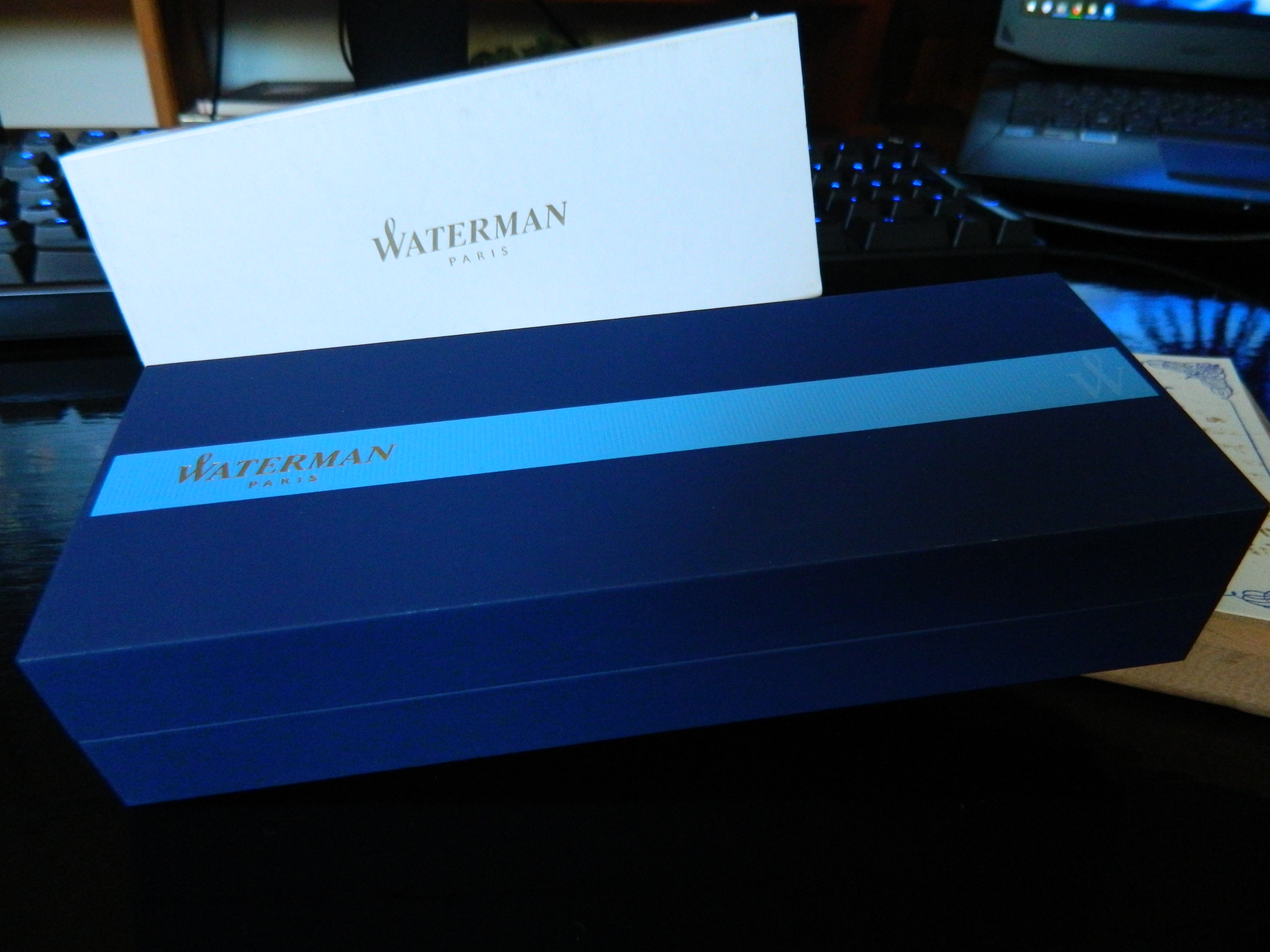 The Waterman packing was classy, solid, attractive, and not too much of it, which made it just about perfect for my tastes.
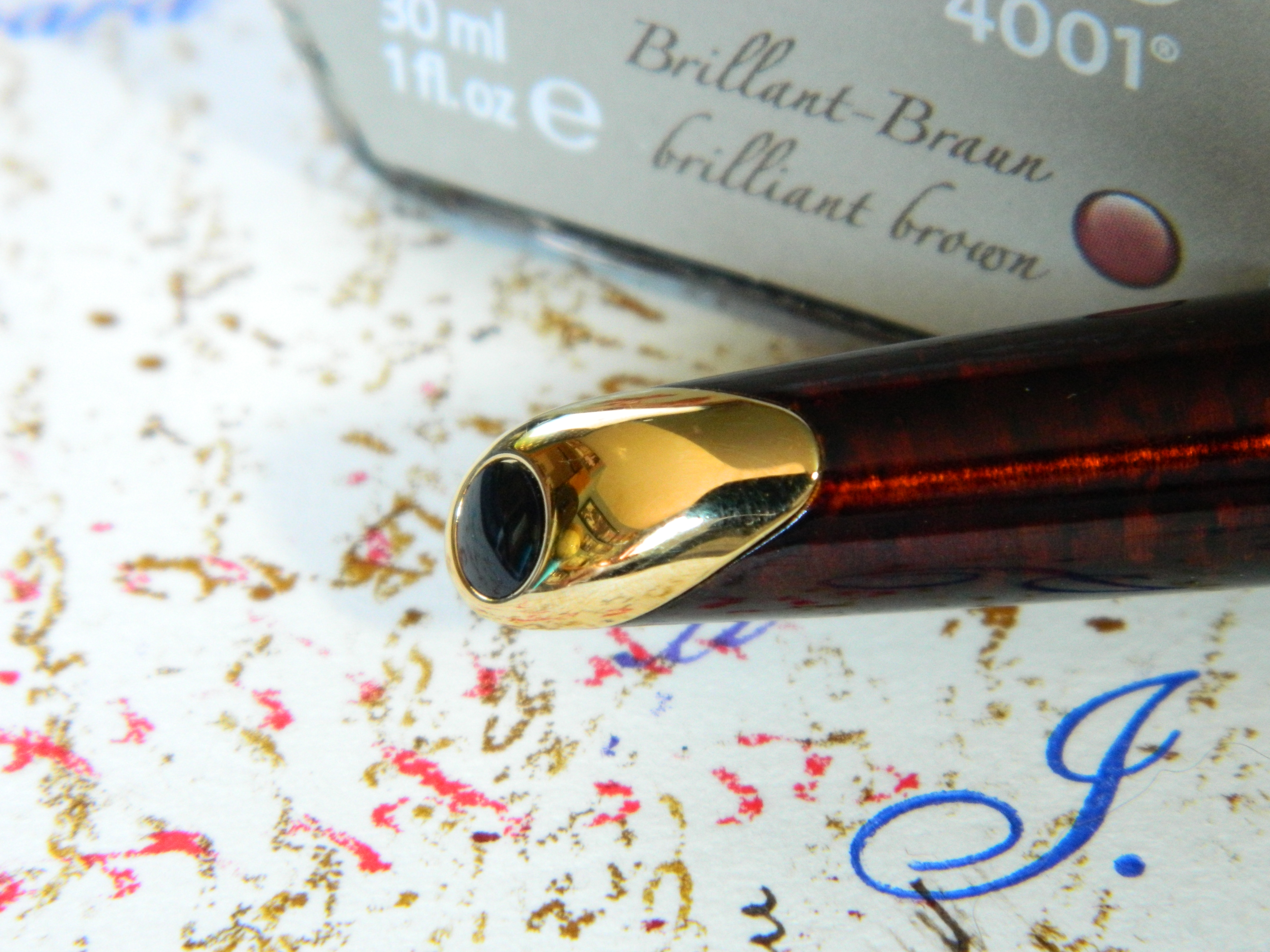
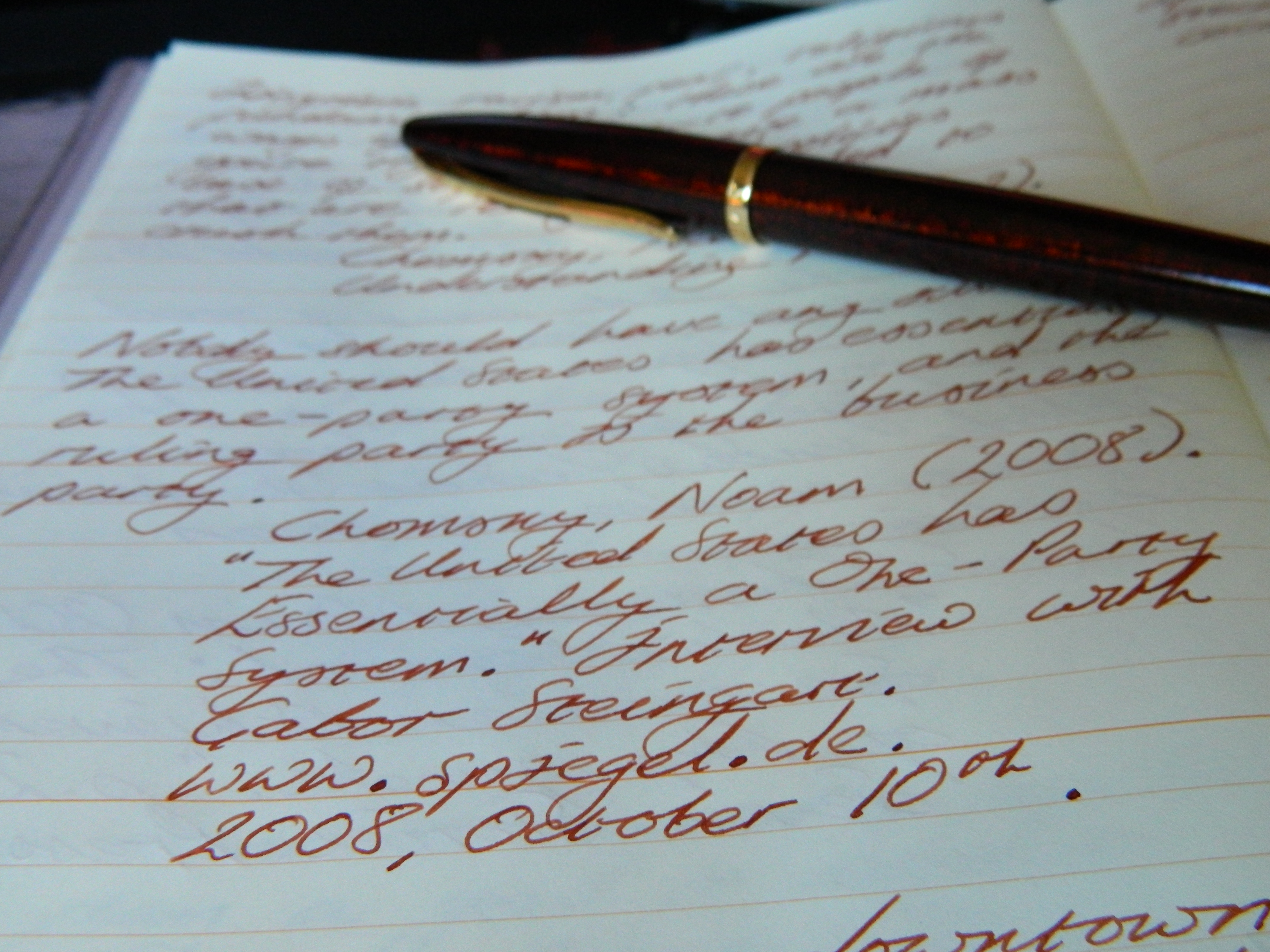
 The pen came with a converter, and I can’t remember now if it came with a cartridge or not. Regardless, I flushed the converter through a couple of times, then attached it to the pen and flushed that too. I had ordered the 18K gold fine nib, and I’m always a bit more careful with a fine than I am anything else. Then I inked the pen with Pelikan’s 4001 Brilliant Brown ($15.50 CAD before taxes, for a 30ml bottle; about $0.52 CAD per ml).
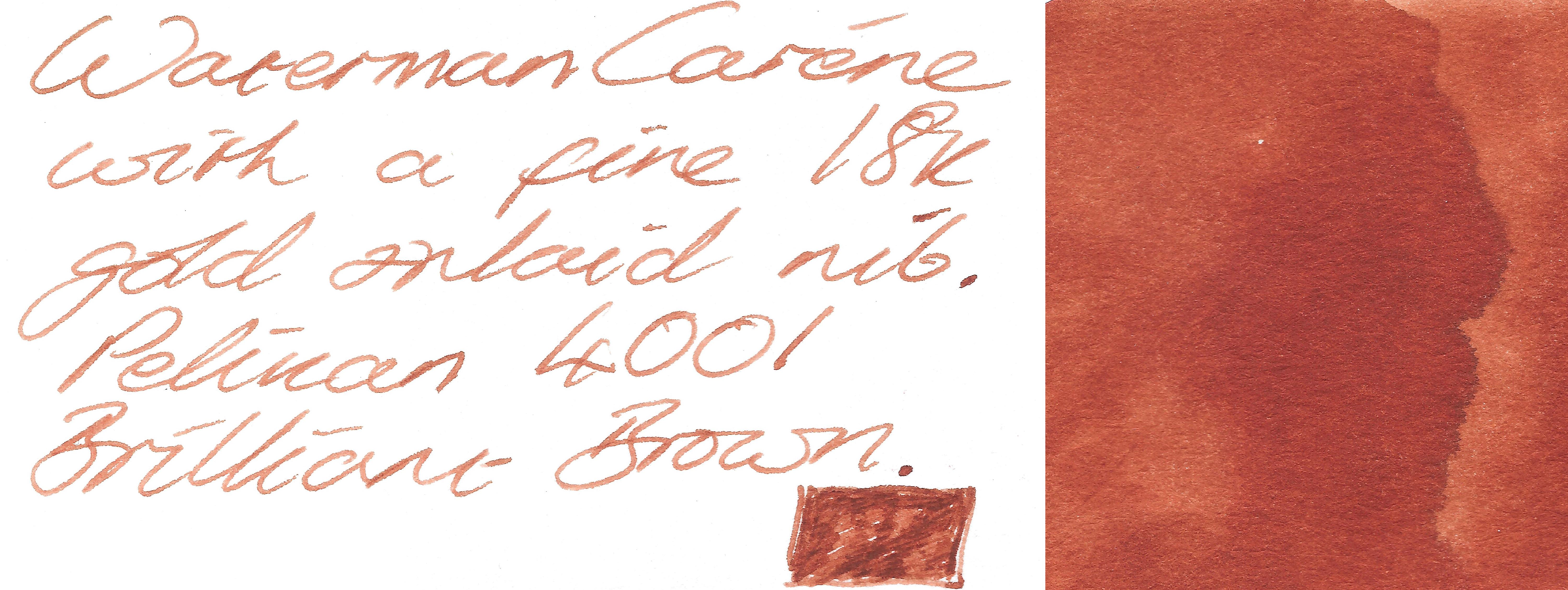 This is a lovely brown, and I thought it would compliment the Waterman beautifully. And it does—now. But when I first inked up that pen…
Skippy… Skippy… Skippy the Bush Kangaroo
Back in the late 60s and early 70s, Australian TV exported their answer to Lassie. A kangaroo that routinely rescued kids trapped down disused coal mines and all the other crap Lassie would get up to; only Skippy would talk to his human pals, and he was a kangaroo. Because, well, Australia and the 60s.
In case you hadn’t got the idea, this pen skipped. Like it was skipping a 30 mile trek through the Australian bush to rescue a starving dog called Lassie. And the converter was next to useless. It would collect ink from the bottle if I put the converter directly into the bottle, but not if it was connected to the pen in any way. Then if I filled the converter directly from the bottle, and turned the knob to push ink into the feed and flood the nib, it wrote perfectly. But when the ink in the nib and feed began to thin out… Skippy would come bounding back.
I was extremely disappointed, because I had already fallen for that amazing amber finish, and the inlaid nib was growing on me.
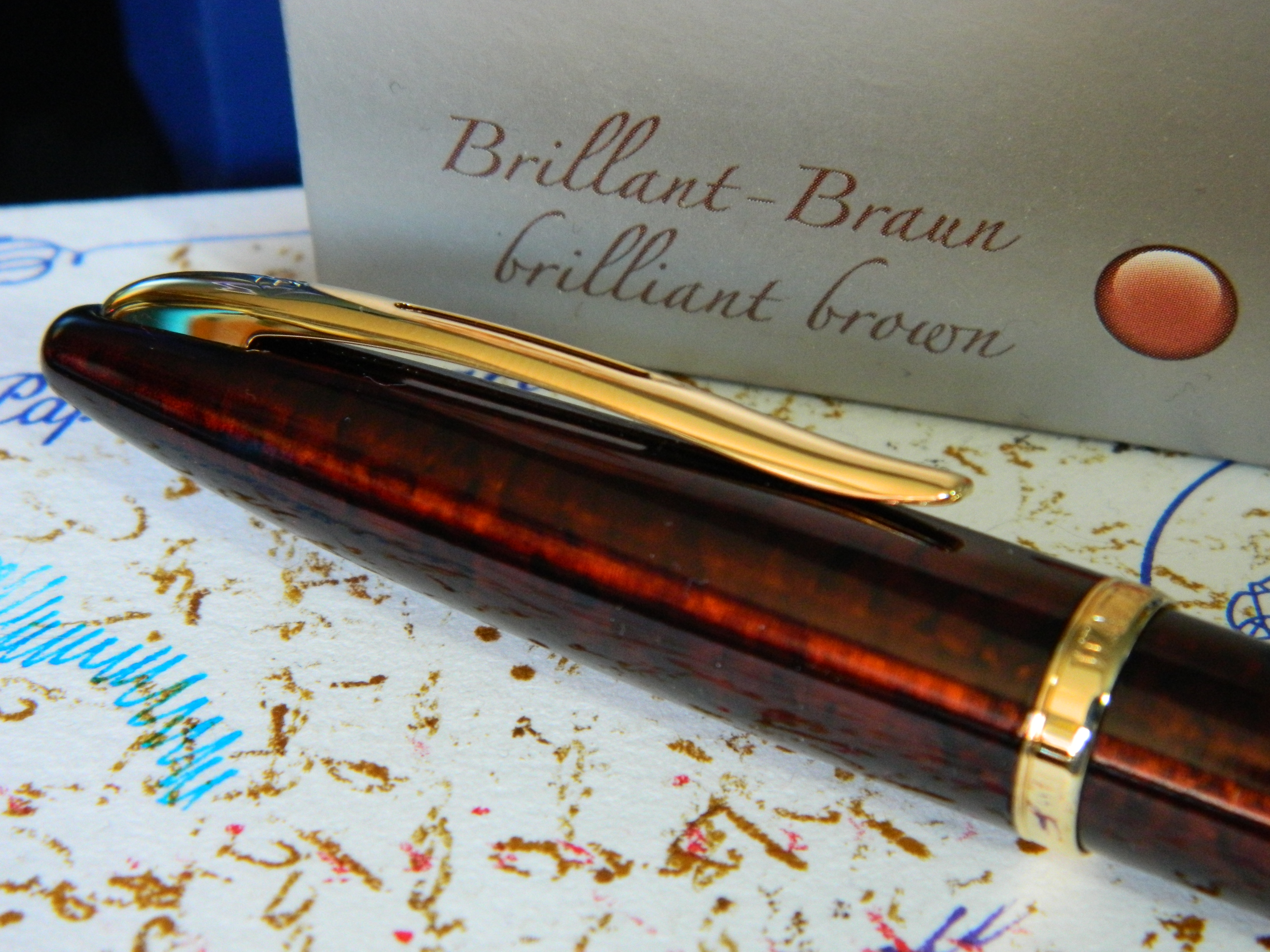
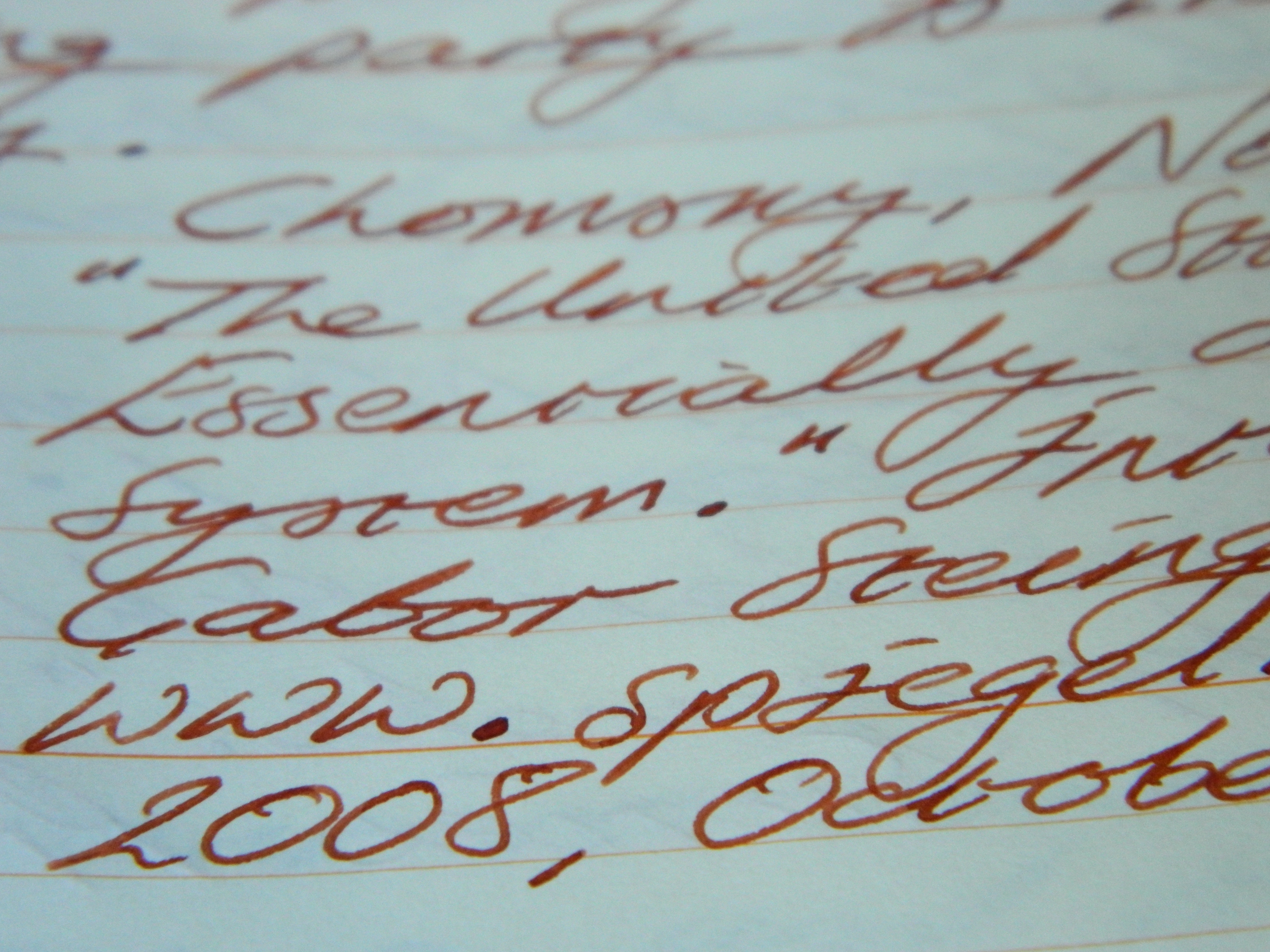
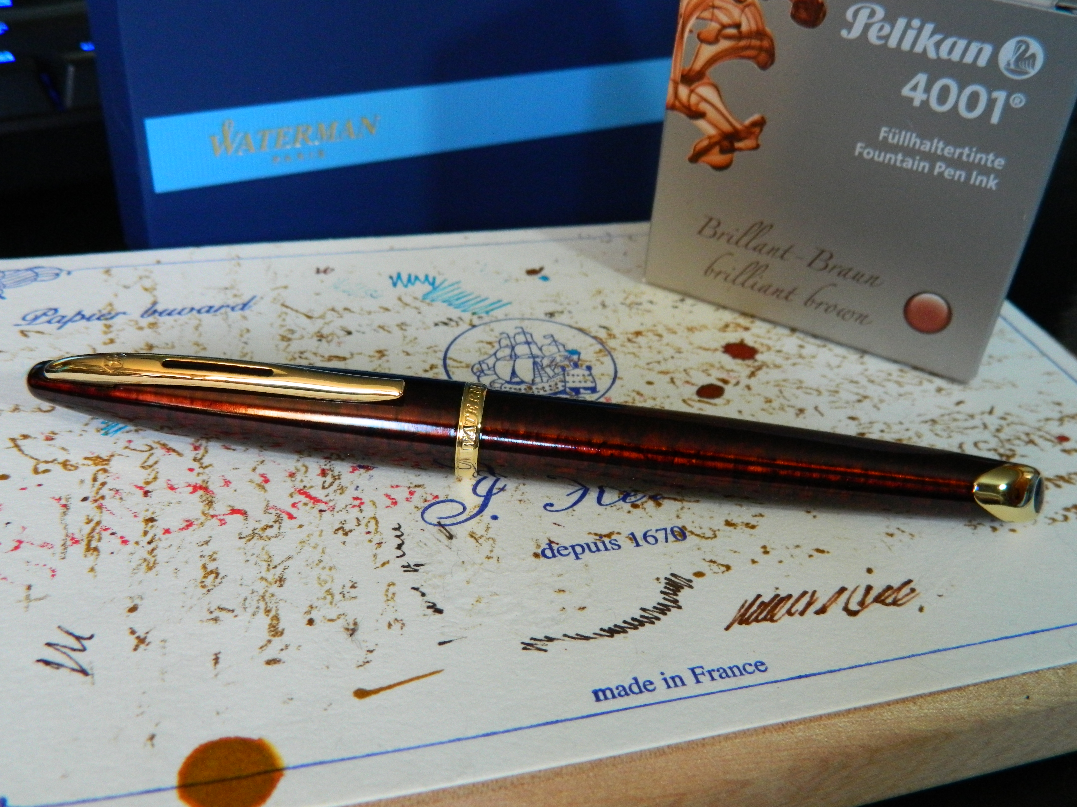 The photo’s here—and anywhere else that I’ve seen them—just don’t don’t do the depth of that coloring any justice at all.
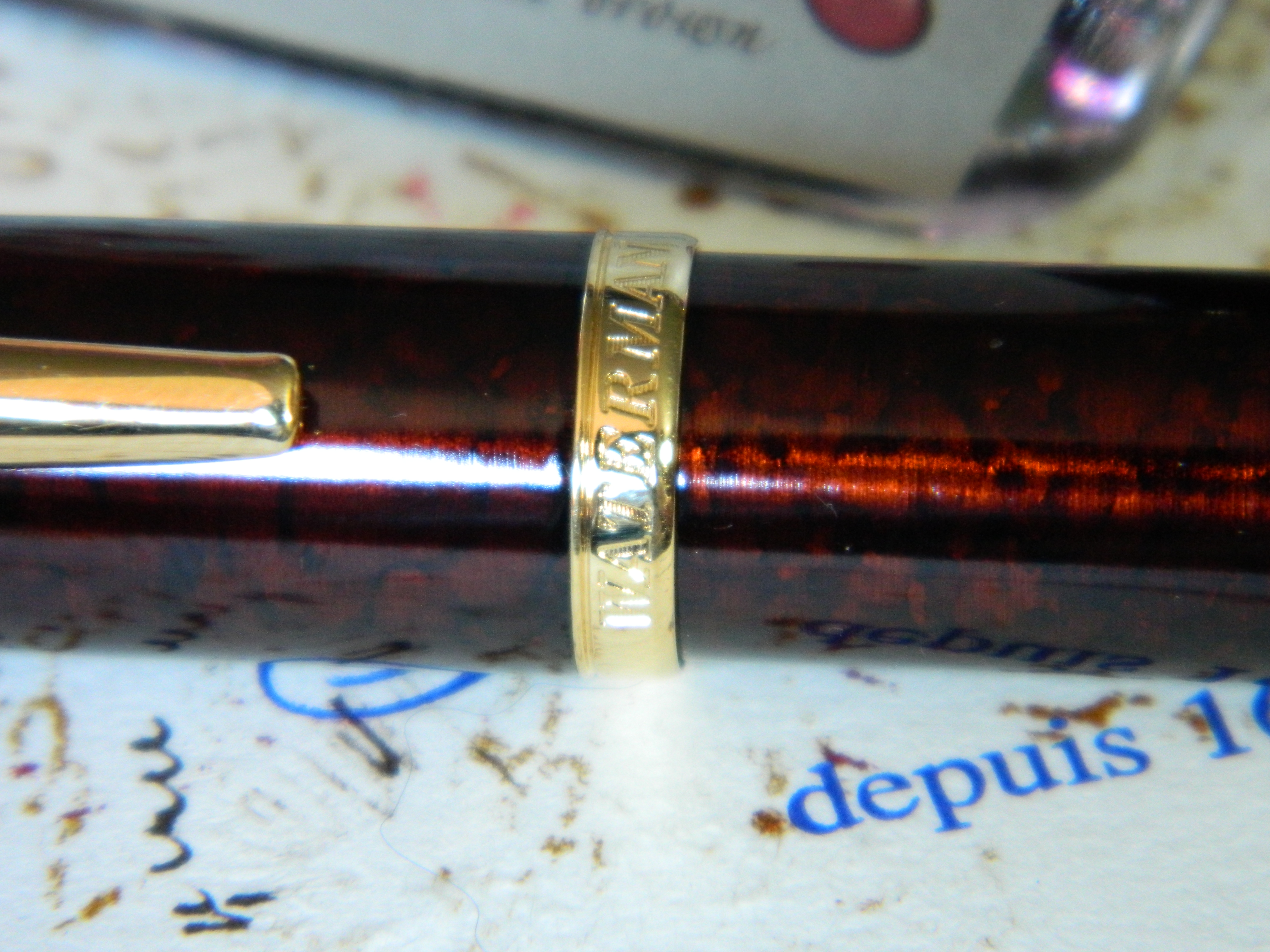
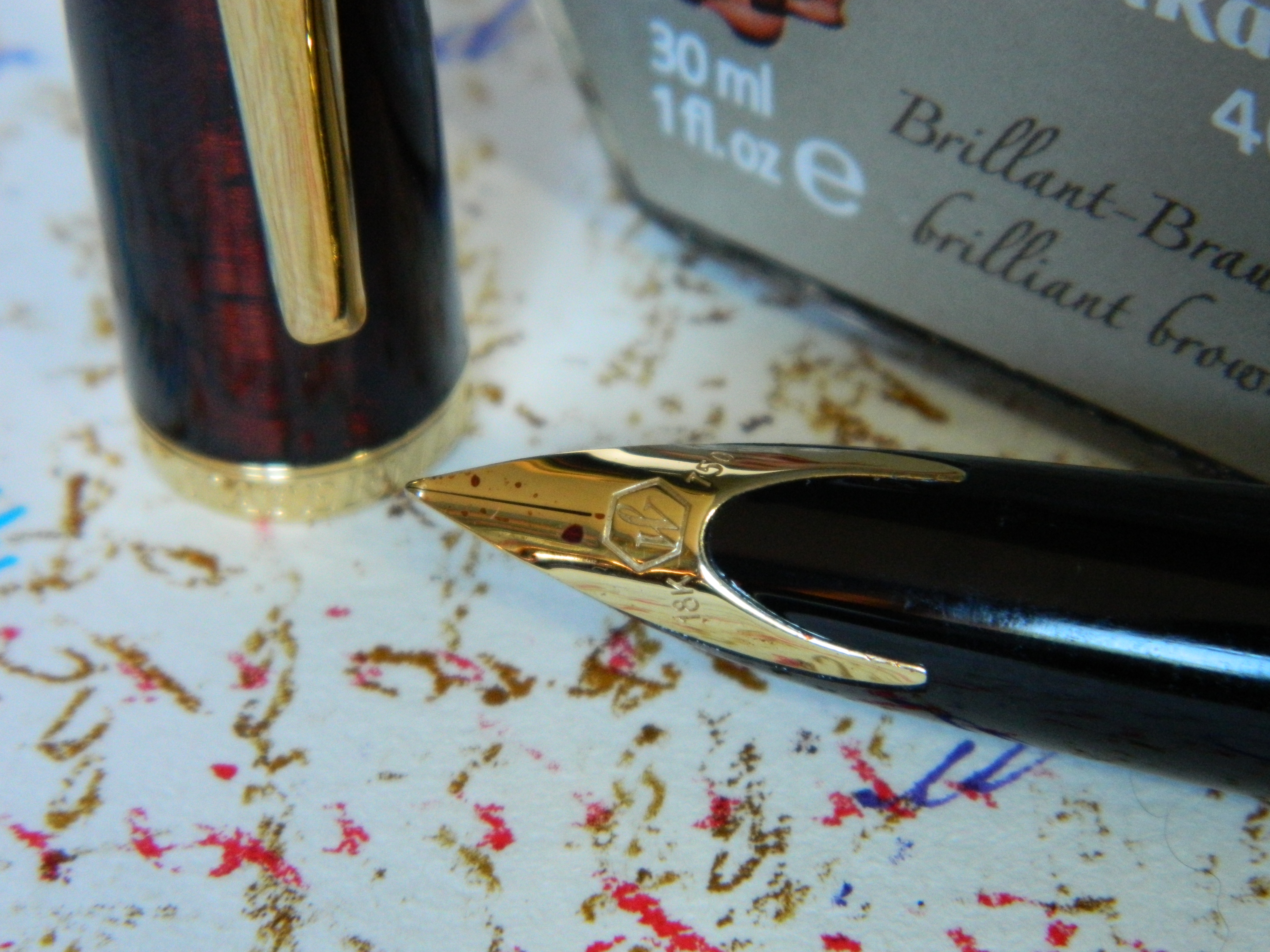
 The trim and clip are 23K gold, and gracefully styled, with Waterman branding around the center band and at the top of the clip.
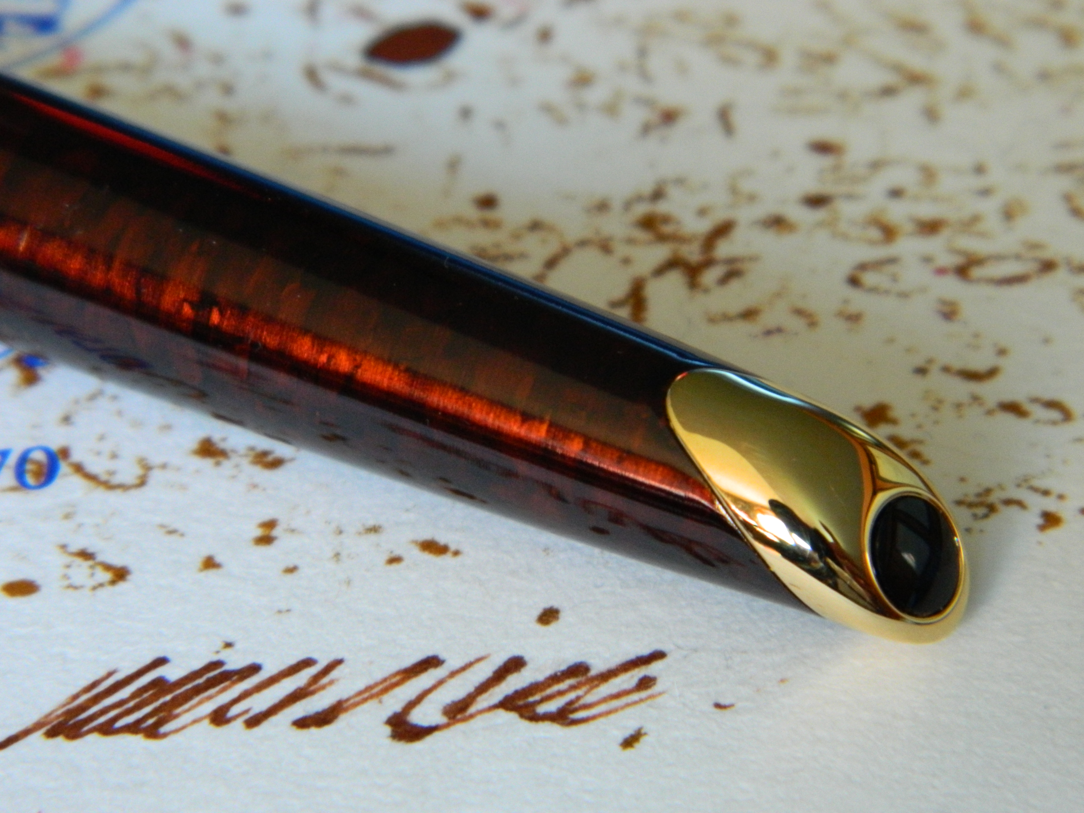 The finial is beautifully curved, and compliments the overall shape of the pen… I’m trying desperately not to sound like Waterman’s marketing and start referring to the swell of ocean waves.
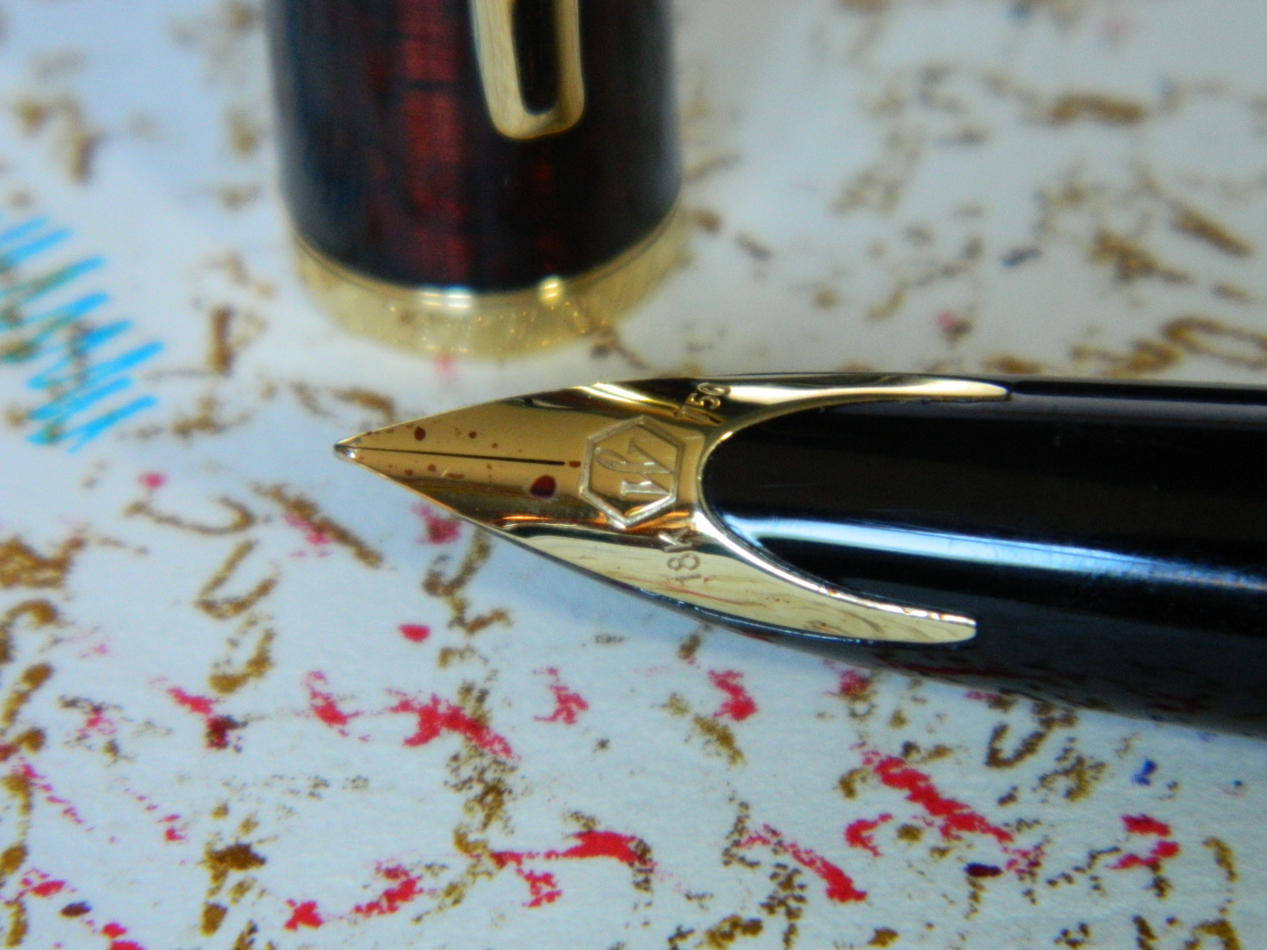 Then there is that 18K inlaid nib, which people seem to either love or loathe. I wasn’t sure about it at first, but I have grown to thoroughly enjoy looking at it as I write.
 But frankly, at this stage it was a four-hundred dollar pen (after taxes) that didn’t write. It didn’t matter what it looked like, or that it felt incredible in my hand. It was a writing instrument that didn’t.
Until I played with that converter.
Did I mention my Edison Collier earlier? I love that pen, but I’ve never used the international standard converter it came with, because I’ve always eye-dropper filled it, or used cartridges when I’ve been away from my desk; sometimes even eye-dropper-filled-cartridges. So I took the Edison converter, and fitted it in the Waterman. It was tight, and quite long, but when I screwed the barrel back into place, it felt like it pushed that converter another half millimeter or so into the section. Then I tried it again…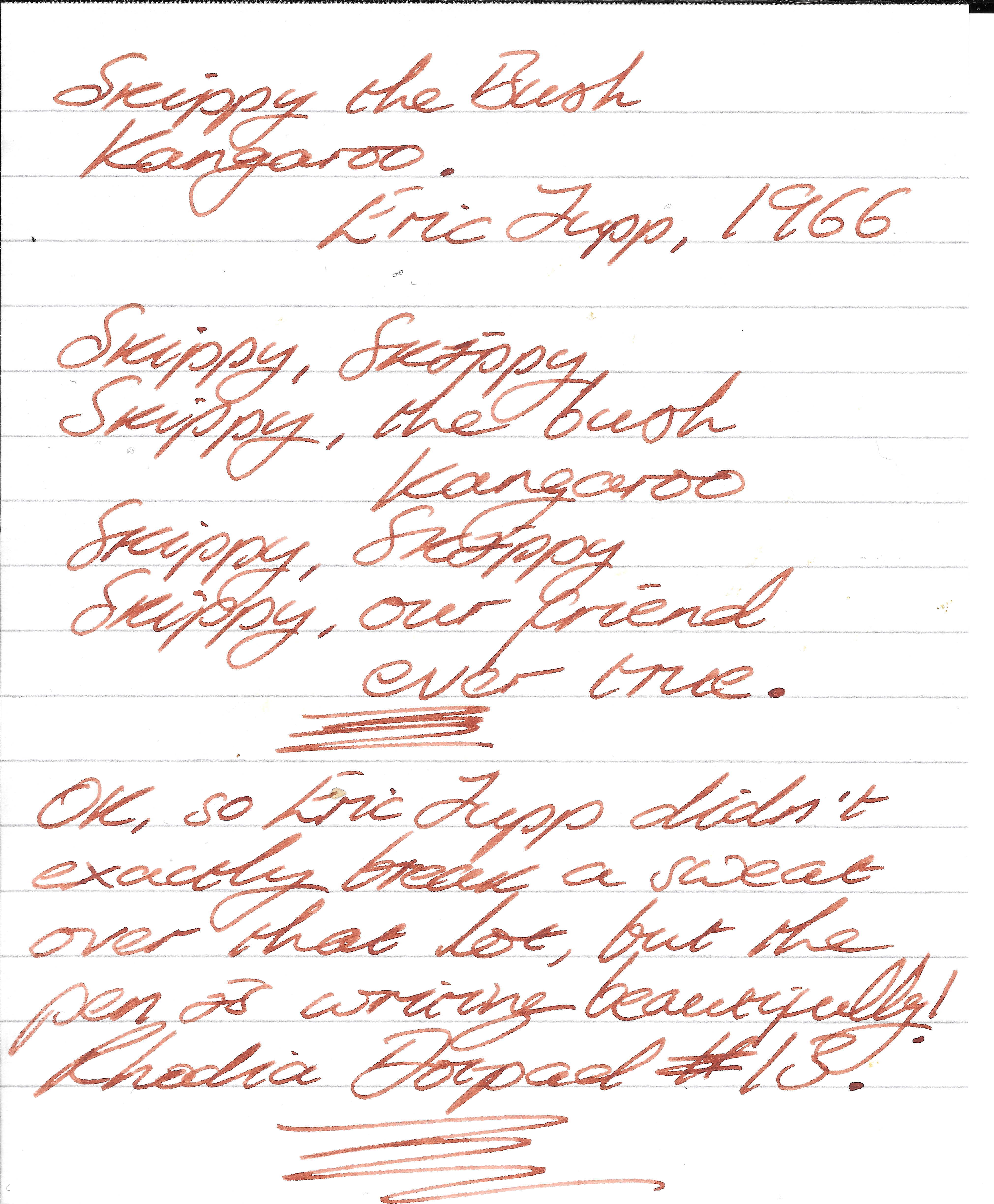
And what a difference. That lovely, coppery brown ink flowed nicely, and kept up with even my fastest scribbling.
Skippy the Bush kangaroo had obviously leaped off into The Outback and fell down a snake pit or something, because I haven’t seen him since.
Just the Facts
At 33.4g, the Waterman Carène is the heaviest pen I own, heavier even (by only a very little bit), than the Lamy Aions. Yet that surprised me, because it sits so comfortably and well-balanced in the hand, that it’s almost no effort to use.
|
mm/g/ml |
in/oz/fl. oz |
|
| Length Unposted: |
127.00 |
5.00 |
| Length Capped: |
143.00 |
5.63 |
| Diameter: |
12.70 |
0.50 |
| Circumference: |
39.90 |
1.57 |
| Length Posted: |
147.00 |
5.79 |
| Weight: |
33.40 |
1.13 |
| Cartridge: |
1.3 |
0.04 |
| Converter: |
0.5 |
0.02 |
It’s also half a centimeter longer than the Sailor 1911L, and more than a centimeter longer than the Pro Gear, which makes it very comfortable in my larger hands.
And What Does It Write Like… Now?
I don’t know if Waterman’s converters are routinely a little shoddy, but the one supplied with this pen certainly was—fortunately, an international standard converter from Edison saved my patience from wearing any more threadbare. The converter problems, coupled with the nib being a bit sensitive to the coating on paper such as Rhodia/Clairefontaine, and Midori’s (MD) wonderful 10th Anniversary notebooks (see the next picture below), means that I would advise being careful of the paper with which you might choose to use this pen. But in my Traveler’s Notebook, on Tomoe River paper, or on anything with a little tooth rather than a shiny coating, this is a glorious writer, and leaves a beautiful, juicy line on the page.
 Although I must admit, that I have double-checked that nib to make sure I really got a fine instead of a medium. For a fine nib, the thickness of the line it leaves is almost indistinguishable from, say, a Platinum medium, or even a Sailor broad.

Summary
I started this blog more than a year ago, on the same quest that most of us embark upon… to find the best writing experience we can, from a fountain pen or pens that are simply a joy to look at and use. Well, with the addition to my collection of the Waterman Carène in Marine Amber, I can honestly say that I just don’t see it getting much better than this. I am lucky enough to have a truly beautiful collection, and this pen is one that I reach for—sometimes even in preference to my Edison or the Sailors—on a daily basis. So, is that it for buying fountain pens? Have I reached my grail? Who knows? But the only thing I do know for sure, is that any pen I might buy from here on out, is going to have to be something truly special to get regular use in preference to the Carène, or any other of my favorites.

Thanks for this great review. Glad to hear that the pen is such a success now after the initial issues with the Waterman converter. And yes, I remember watching Skippy when I got home from school.
I do not have this pen but was once nearly tempted by a handsome black version with a palladium cap.(‘shiny!’).
LikeLiked by 1 person
Highly recommended!
LikeLike
I can’t afford to look at that pen. Although in a few quick glimpses, I did notice its yacht-ish curves. I also really like the ink!
LikeLiked by 1 person
The Brilliant Brown is really nice, and nowhere near as pricey as some. In fact, it’s damn near identical to Sailor Kobe Arima Amber — but nicer — and about half the price.
LikeLike
Seeing the price of the pen (and no judgment intended, I just prefer to spend all my money on books) makes me understand ink prices better. I did buy myself a Citrus Bali Platinum Plaisir earlier in the summer. It might do well with some brown ink. (Right now it’s sporting a nice denim blue.)
LikeLiked by 1 person
I love the Plaisir, and all the different colors let me indulge in my matching pen to ink obsession.
LikeLiked by 1 person
While I’m sure it is possible that you will never covet another pen, I think the probability is very near zero… 😉
It is beautiful! I hope you continue to enjoy it for a long time.
LikeLiked by 1 person
You are a very wise woman 😊
LikeLike
Great review on a great pen.
LikeLike
Thank you! I find myself reaching for the Waterman more than most others these days; over and above Sailors and even my Montblanc 146. It really is a great writer.
LikeLike
Pingback: This week in faking the writing part – Writing
The Carene was my first nice fountain pen about 18ish years ago, I got it in the blue with rhodium/palladium (silver coloured) trim, back before they changed the blue colour to a more purple hue. it’s the broadest Medium nib I’ve used, but over the years I’ve never stopped using it, it just seems to get better and better. I agree about it being temperamental about the ink source, but with the right converter and some reasonably free flowing ink it’s lovely to write with.
LikeLike
Absolutely, couldn’t agree more with every word! Thanks for commenting Rob.
LikeLike
I also have this pen but with a fine oblique nib which I love. I use it daily.
I never had issues with skipping but have with bleed around the ‘horns’ where the nib is inlaid to the barrel. I use the Waterman converter with Waterman blue ink. I’ve seen this issue described in other reviews.
Do you have the same issue with the converter you use ? If not, I may swap out my one for one like you have.
LikeLiked by 1 person
Thanks for reading and replying Julia! No, I’ve never had that problem. The nib can be picky about the paper it likes, but that’s as far as my criticisms go really. Good luck!!
LikeLike