
A brace of sonnets? A pair of Parkers? A tale of two nibs? Cascade Gold and the Firedance Kid? How much more desperate can I get at reaching for titles that’ll just make everybody cringe?
This time round, I’m looking at a pair of vintage Parker Sonnets from about the mid’ 1990s. I’m also trying to engender some excitement out there, because, well… it seems like there’s been a Parker Sonnet, rattling around in an old writing desk in everybody’s parents’ house, for almost the last 30 years. Now even I’m trying to stifle a yawn, but some of them are quite nice, really.
Take these two, on the left the Firedance Lacquer, from Peyton Street Pens in the United States, and on the right, the Cascade Gold, from John Culmer’s Toronto-based Peel Pen Shop…

The Firedance Lacquer is a lightweight metal pen, with a deep, mottled red lacquer finish. In these photo’s, and with my lighting, the pen really doesn’t look at its best. Next to it, with a 23K gold-plated, rippling geometric pattern, the Cascade Gold finish can’t help but look great in any lighting.
Please tell me if I’m beginning to sound too much like a used-car salesman.
At this point I have to take an aside and just tell you about a car salesman, and his less than stunning technique whilst trying to sell a rather expensive BMW to my dearest friend and his wife back in London, England. My friend and his now tragically departed wife were studying a shiny new car in the BMW showroom, and Mr. Slicked-Back-Hair-Cologne-and-Bottled-Sun-Tan, had been working on them for some while. They were looking over the interior and the salesman was discussing the luxurious leather upholstery. There was a pause, my friends’ wife began, “Well, the problem with the leather is that, well, you see…” she was almost apologetic as she continued… “I’m a vegetarian.” There was another, briefer pause, and the salesman jumped in with both feet and a rich cockney accent, heavy with peppermint mouthwash, “Well, I’m not askin’ you to eat it luv.”
I think they bought a Mercedes.
Anyway, I digress, back to the pens.

Both pens use the same gold-plated furniture, including the distinctive Parker arrow clip on a push-on/pull-off cap.

The texture of the gold finish adds a warmth and a pleasant sensation to the movement of the pen in my hand, and I’ve found that I’ve come to look forward to that feedback. The deep red lacquer finish is, of course, highly polished, and presents a great depth of shading, and an almost moving pattern as it catches the light.

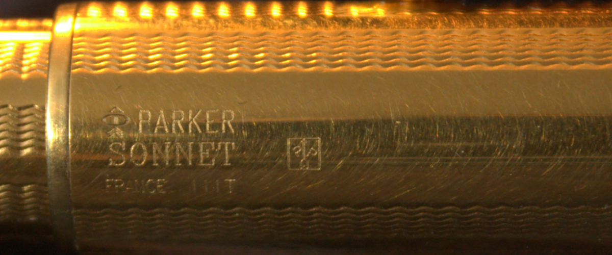
Ends of the caps and finials are similar, in that they are finished with a black, circular inset. The Cascade Gold has—as you can see from the pictures—suffered one or two minor indents over the years.

The lower end of the cap on the Cascade Gold model also shows a clear engraving panel, which includes branding and date codes…

Checking the rather fascinating Parker Pens Penography web site (https://parkerpens.net/codekey.html), shows a detailed list of Parker branding symbols and date codes. The markings | | | T (see below), confirm that this pen was produced in the third quarter of 1995 by Parker France.
I believe the Firedance Lacquer should have had something similar displayed on its cap; Peyton Street Pens have a picture of what that would have looked like…

But even studying my pen for some considerable length of time with magnifying lens, bright lights and younger eyes, reveals no trace of those cap markings. It seems obvious that, with the Cascade Gold pen, the markings are stamped into the metal, whereas they would simply be on the surface of the lacquered cap, and so I would surmise, that they have just worn away over time; which I find a pity… I quite like that sort of thing.

But What Do they Write Like?
When you ink them up, they’re beautiful. The Firedance Laquer came with a lovely 18K gold stub (mediumish) nib (bottom of the picture below), and the Cascade Gold, with an 18K gold medium nib (below, top). Both bear the Parker USA logo instead of Parker France. The nib size is indicated in the upper part of the feed on these Parker nibs, instead of on the metal of the actual nib (see the Peyton Street Pens page again for a better illustration).
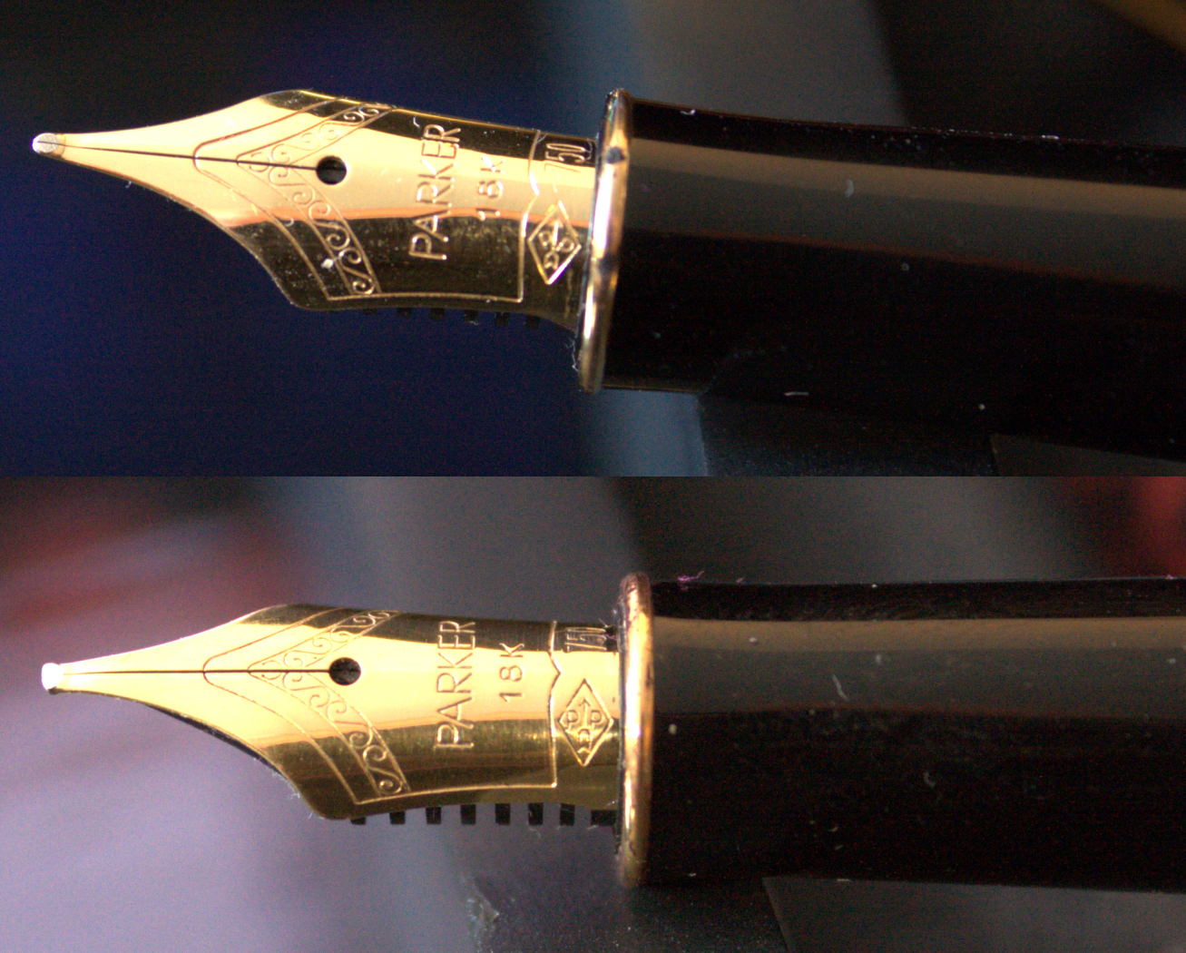
The great thing about owning two identical models, is that swapping the sections and nib units between each pen is a trivial matter of unscrewing the section from the barrel. Both pens are cartridge/converter fillers, so swapping the nib and section around needn’t be messy, because the cartridge/converter can simply go with the unit.

There is one fly in the inkwell however, the stub nib from Peyton Street Pens has proved to be considerably less smooth than John Culmer’s supplied effort. I draw no conclusions from this one pen. The lacquered Sonnet is the only pen I have bought from Peyton Street Pens, and they might well supply wonderfully tuned nibs and pens on a daily basis; but this time, it wasn’t. In comparison, I have bought a number of pens from John Culmer’s outlet, and they have, to a nib, been absolutely faultless. Both pens write well—very well in fact—but the stub is a fraction rough for my liking. Also, they are not low maintenance, they need to be kept clean when not in use, or else used regularly… very regularly.
A Slightly Less Than Dynamic Duo
If I had drawn up this review after only a few days of use, then I would have ended at the last paragraph. But I have had both of these pens for a number of months now, and I have to say, they are no longer inked. I might even consider selling them on. My problem is dry starts, on both pens. If I leave either pen for two to three days without using it, then it can be quite a pain in the backside to get it writing again. I usually end up dipping the nib in a bottle of whatever ink I have it loaded with, and getting it started the messy way. I’m afraid I can’t live with that. A pen has to pull its weight around here, and start when it’s needed, or it’s out. They get no special favors for having a flashy name or a gold finish. If I compare either of these Parkers to my 1961 Sheaffer Imperial Triumph, with its beautiful, inlaid, 14K gold, fine nib, then they lose every time. The Sheaffer—more than thirty years older than either of the Parkers—has never been faulted once.
Has anybody out there in pen land bought any of the current Sonnet lines? Is the drying out of the nibs something to do with their older caps, and maybe a less than tight seal? Or is this something that the design suffers from I wonder? You see, I quite like these pens, they’re comfortable, and write well when they’re going, so I wouldn’t be adverse to adding a more modern Sonnet to my pen case… just so long as I could rely on it.

You had me at sonnet.
My spouse bought me a sonnet in the early aughts. It is beautiful and elegant, and I have an unholy love of its 14-line counterpart. But I can’t get it to write, which moves me to rage. I went right back to gel pens because the last thing I need is one more freaking barrier to writing.
Could it be the pen and not the writer??
LikeLiked by 1 person
I am erring on the pen at present, and I have been reading of others in a similar position. Things are not looking good for the Sonnet 😦
LikeLike
I have a number of Sonnets and love them dearly, and have occasionally encountered the problem you describe. I will say that it is probably just that the nib is just a bit tight and needs some minor adjustment. As lovely as those Parker nibs can be, the QC as the 90s went on was not always the best. However, any nib doctor can probably sort it right out for you.
And those Sonnets are incredibly comfortable to write with and are some of my go to daily writers.
LikeLike
I have a number of sonnets and have occasionally encountered the problem you describe. It is probably just a case of too tight tines, and even nib doctor should be able to sort it out straight away. Unfortunately, as the ’90s wore on, Parker QC dipped quite a bit (management/ownership changes), but the pens remained supremely comfortable to write with. The two I have are some of my favorite daily writers.
Hopefully you have someone you can send them to to get a small adjustment done to!
LikeLike
Hi, thanks for commenting! I must admit, I haven’t bothered tweaking the nibs, because they wrote beautifully, but dried out after a day or so. As a result, I jumped to the conclusion that it was something to do with the cap. That may teach me not to be too hasty! I’ll take another look, thank you!
LikeLike
I will say that it might not be exactly what you experienced, but it sounds similar. When I first inked one in particular up, it wrote fine (most likely the ink in the feed making it easy for ink to flow), but after that it was like I was trying to write with something exceptionally dry until it finally got started. I put the nib under a loupe and it was like there was almost not space between the tines for the ink to flow. I hope that is all that it is!! If you have a loupe, I would compare two nibs and see.
LikeLiked by 1 person
Most definitely, thanks again 🙂
LikeLike
You know you’re getting old when a pen you bought new and have used practically daily since the mid-1990s is described as “vintage”! The lacquer pen has been a faultless companion ever since. For most of those years it was the only pen in my jacket pocket every day. No hard starts, just smooth writing. It’s only just been supplanted as a daily carry since I dropped it nib down on a hard floor, then bashed it into a desk when picking it up.
LikeLike
Noooo! Tragedy! But the silver lining is that there is quite a market in Sonnet gold nib units for reasonable prices. And I know what you mean about “vintage”. I have a leather jacket that’s older than both of those pens and, frankly, looks better every year. The same, sadly, cannot be said for its owner. Good luck, and thanks for commenting!
LikeLike