
I have made no secret of my traditionalist taste in fountain pens. I may go off the rails occasionally and ogle something earthy with a bit of gold marbling, or even go completely crazy and pick something up in burgundy and gold with a touch of translucence about the barrel. But if you were to take a visual stroll through the thirty-something pens I keep to hand, there is more than a whiff of boring old fart hovering over my collection. Or—as I prefer to call it—understated style and elegance. And you won’t find more of an epitome of understated style and elegance (though even I can smell a little something here), than a vintage Montblanc Meisterstück in the traditional black and gold finish. Arguably, it’s the standard that every other manufacturer, for about the last century, has aped at one time or another.

I should also admit, to being a sharp critic of how much is payed for a plastic pen (sorry, precious resin) with a 14K gold nib, and even premium bottles of ink. I should really keep my mouth shut, but here I go again. In Canadian dollars, a new Montblanc Meisterstück Le Grand (what was the old 146), will set you back about $1100 CAD, including relevant taxes, from a fancy Montblanc boutique in Toronto or Ottawa. A very similar Sailor 1911L, with a 21K gold nib, which (in my humble opinion) is every bit as good as Montblanc’s, would be around $400 CAD; whilst a Platinum Century 3776 can be picked up for a fraction over $100 CAD—leaving plenty of change to have a beautifully personalized custom nib grind, from an industry-leading nibmeister, and still come in with enough cash left over for a weekend away in a half-decent hotel. Well then, would I buy a new Meisterstück Le Grand? No. Definitely not. Not a bloody chance. Even if $1100 represented as much of my funds as does, say, the price of a Platinum 3776 at the moment? Ah, well, there you have me. Maybe. Probably. OK, yes. Definitely. In a heartbeat. Why? Well, sit back and listen, and I’ll tell you a tale of naked consumerism, brought on by the triumph of decades of marketing, and subjective judgement that you just can’t quite put your finger on. And of course, I’m a sucker for a nice fountain pen.
A Nice Vintage Fountain Pen… or Two
![]() So, when I laid eyes on a couple of beautiful vintage Montblancs, sitting on the electronic shelves of John Culmer’s Peel Pen Shop, and selling for wayyyyy less than the full retail price of new models, I certainly began to feel the call from at least one of them. After some e-mails to and from, and a great deal of patience on his side, I opted to begin my Montblanc ascent with their smallest Meisterstück, the 144 Classique (Classic). And when it arrived, I was very pleasantly surprised by this little pen… and so, unfortunately, was my wife. The 144 stayed with me only days. Just long enough to get a feel for it, write it empty a couple of times, clean it up and pass it along with a bottle of Monteverde Napa Burgundy from a local art and stationery shop that’s just come to my notice—Art Noise on Princess Street, Kingston, Ontario. All to the plaintive tune of, “Oh! I’ve always wanted a Montblanc pen!” Which is simply emotional blackmail, and works every time.
So, when I laid eyes on a couple of beautiful vintage Montblancs, sitting on the electronic shelves of John Culmer’s Peel Pen Shop, and selling for wayyyyy less than the full retail price of new models, I certainly began to feel the call from at least one of them. After some e-mails to and from, and a great deal of patience on his side, I opted to begin my Montblanc ascent with their smallest Meisterstück, the 144 Classique (Classic). And when it arrived, I was very pleasantly surprised by this little pen… and so, unfortunately, was my wife. The 144 stayed with me only days. Just long enough to get a feel for it, write it empty a couple of times, clean it up and pass it along with a bottle of Monteverde Napa Burgundy from a local art and stationery shop that’s just come to my notice—Art Noise on Princess Street, Kingston, Ontario. All to the plaintive tune of, “Oh! I’ve always wanted a Montblanc pen!” Which is simply emotional blackmail, and works every time.
And there you have the triumph of decades of marketing that I was talking about. My wife is a Professor, with degrees in business studies (specializing in marketing, so she knows all the tricks), and education. She has never used a Montblanc pen in her life, She has only ever drooled over them in glass cases, usually at airports. Yet she has always wanted one. Me? I’ve used a few, and have been unimpressed by a third of them (give or take), but even then, they have been one of those small objects of desire. Until, that is, John Culmer sent me the Meisterstück 144 (medium), followed by its big brother, the 146 (Le Grand), c1989, with an extra-fine (XF) nib. Now I am smitten.
Firstly, the 144 Classic/Classique is not a large pen. From past experience, it’s not even a pen I thought I would take to because of its size. But it was significantly cheaper than the 146, so I thought of it as a kind of Montblanc starter. The picture below gives as good an idea as I can provide of the size of the two Montblancs, compared to some more current pens in my regular line-up…

Will you look at that??!! Yellow and black??!! I must have been drunk… but that’s an amazing pen all the same. Maybe I’ll review it one day.
The 144 Classique
While the Meisterstück 144 isn’t the smallest pen in the line-up, it sort of feels like it, because of its slimmer barrel diameter. Yet it’s easier for my large hands to handle than, say, the Sailor Pro Gear Slim, because it’s 6mm longer. This was just great for me. It was comfortable in the hand, a convenient cartridge/converter filler, and not wickedly expensive… and it wrote beautifully. That 14K medium nib glided across the page… until it glided across the page for somebody else, and I was left back at base camp, staring longingly at the Montblanc peaks from afar. Or at least, from the other office across the passageway just passed the master bedroom.
But it felt like afar.
To cut a long story short, I liked the 144—a lot—but it could be improved. If I had three wishes, I would make it just a bit larger, all-over; maybe make the line produced by that beautiful 14K gold nib a little narrower, whilst making the nib itself a bit more visually impressive; and lastly, I’d probably increase the ink capacity, so that I could go for longer periods writing with that incredible nib.
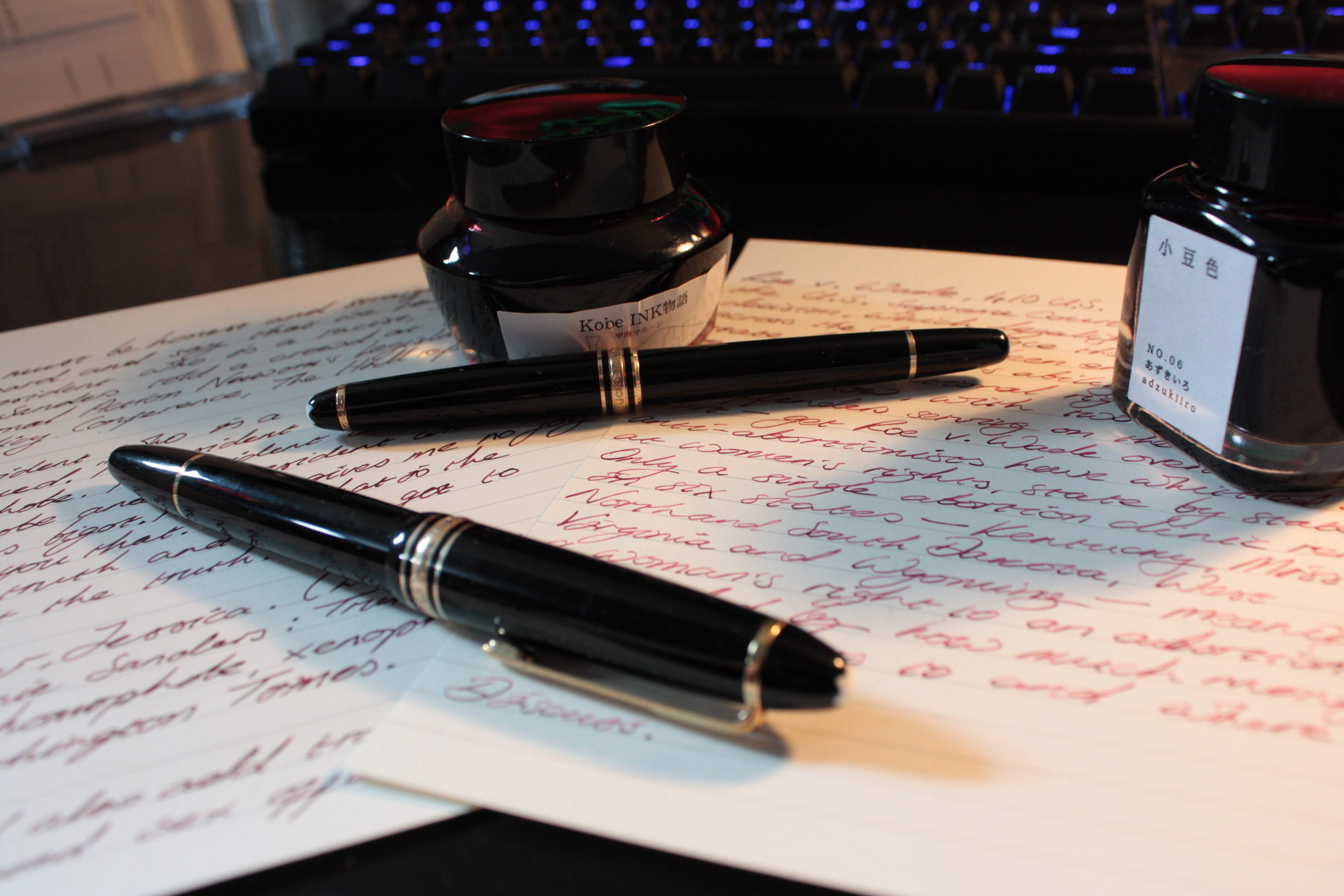
 And as if by magic, there appeared on my desk a package containing a shiny, vintage Montblanc 146 (Le Grand, c1989), in black and gold, with a 14K gold XF nib, and an ink window onto the piston-filled chamber, that was holding a liberal measure of Kyo No Oto Adzukiiro (Red Bean) ink.
Many thanks to John Culmer, who I’d be willing to lay money, had never thought of himself as anybody’s fairy penmother before.

It was late when I got to play with both pens… mainly because I had to wait for my wife to go to bed, before I could sneak her 144 out of her office to take a photo. Hence the photo is a bit dark. Sorry. But you get another idea of the size difference between the two here as well.

What else can I say about the Montblanc Meisterstück that hasn’t been said elsewhere? Well, I’ve tried by comparing the 144 and the 146. Don’t be too afraid of the 144 if you like larger pens, strangely it seems to suit me despite its size.

And regardless of all other features, the nibs on both of these pens are up there with the absolute best that I have ever used. Both pens wrote flawlessly straight out of their boxes—which I must say were the Peel Pen Shop’s own cardboard packaging rather than Montblanc’s. This, I have found, is pretty standard for vintage pens that have been sourced from various places over the years, and shouldn’t be thought of as a black mark against the dealer. Also, just how much the writing ability of vintage pens from the Peel Pen Shop might be down to John Culmer’s care, and last-minute servicing, before the pens leave his hands, is—for me—an unknown factor, but should not be discounted when considering a retailer of vintage pens.
The 146 Le Grand
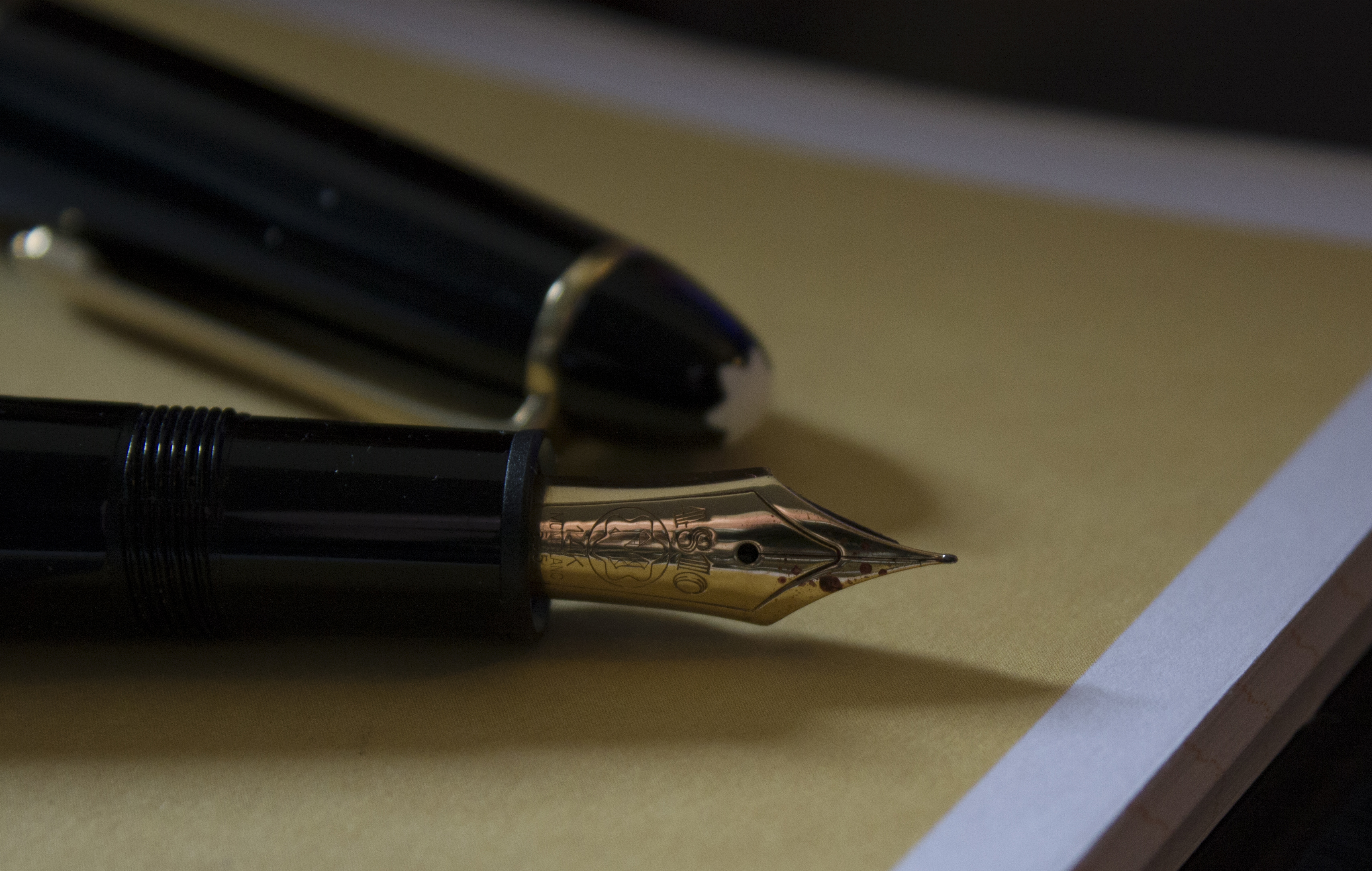
Both nibs bore the usual Montblanc markings, “4810” being the height in meters (about 15,782 feet) of the alpine Mont Blanc peak (I had originally posted 4810 as the height in feet, but was corrected by Charlie—see below—thank you Charlie); 14K; the Montblanc brand name; and the number “585” which Charlie also points out is intended to represent 14/24, and thereby signifying 14K. But, since 14 ÷ 24 is actually 0.583333333333333 and doesn’t round up to 0.585 no matter how you try and do the calc’s, then I might be tempted to debate the validity of that one. What can I say? I spend my days eyeball deep in quantitative data analysis, so I’m finicky about this sort of stuff.

The cap band is inscribed with the branding MONTBLANC…
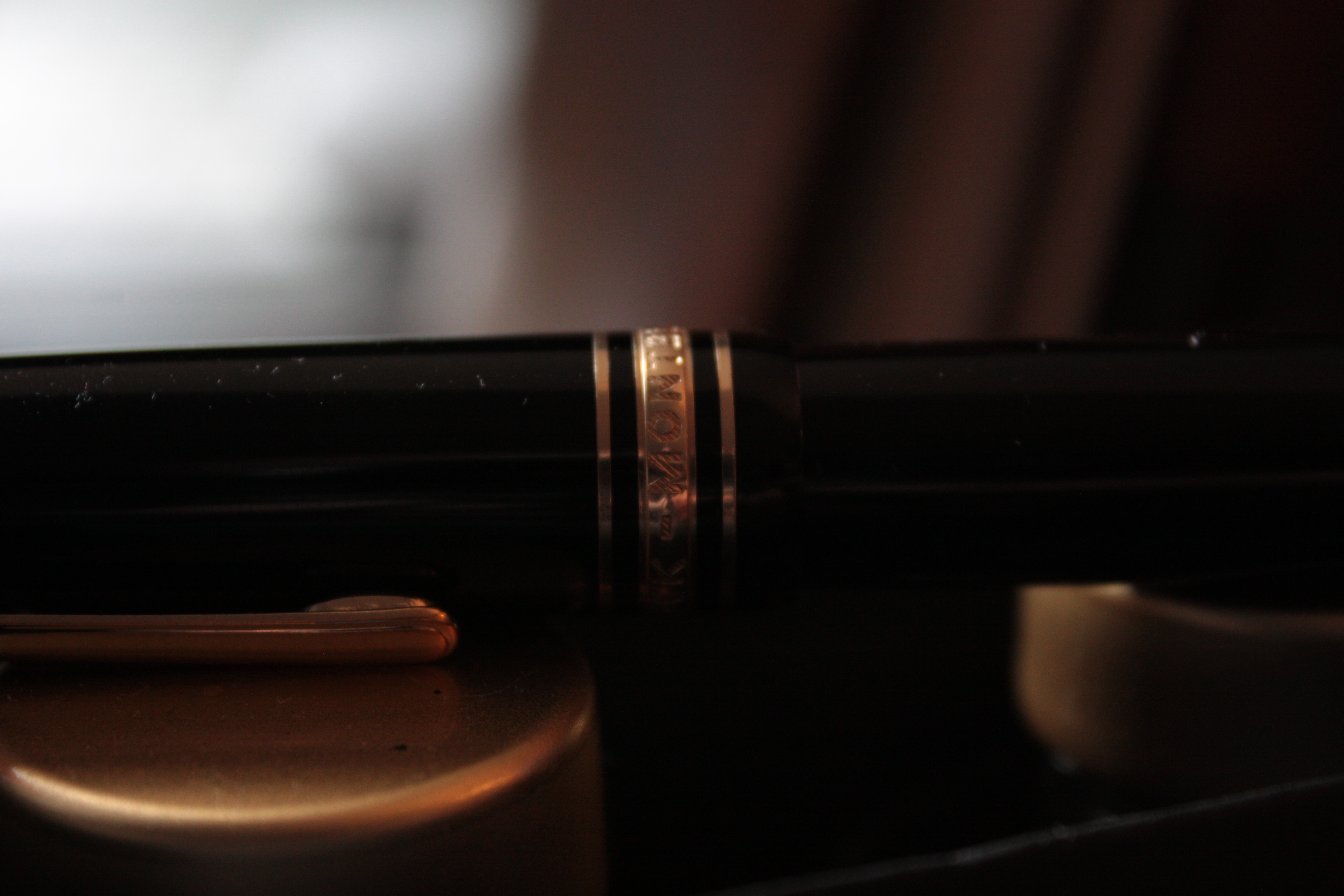
… MEISTERSTÜCK (Masterpiece).

Neither of these pens have serial numbers, Montblanc started adding serial numbers in 1989, and they switched from etching W GERMANY around the band at the top of the clip, to simply GERMANY. Both of these pens are consistent with the latter 1989 markings, and the Peel Pen Shop’s provenance for the pens they hold in stock.
So What Did They Write Like?
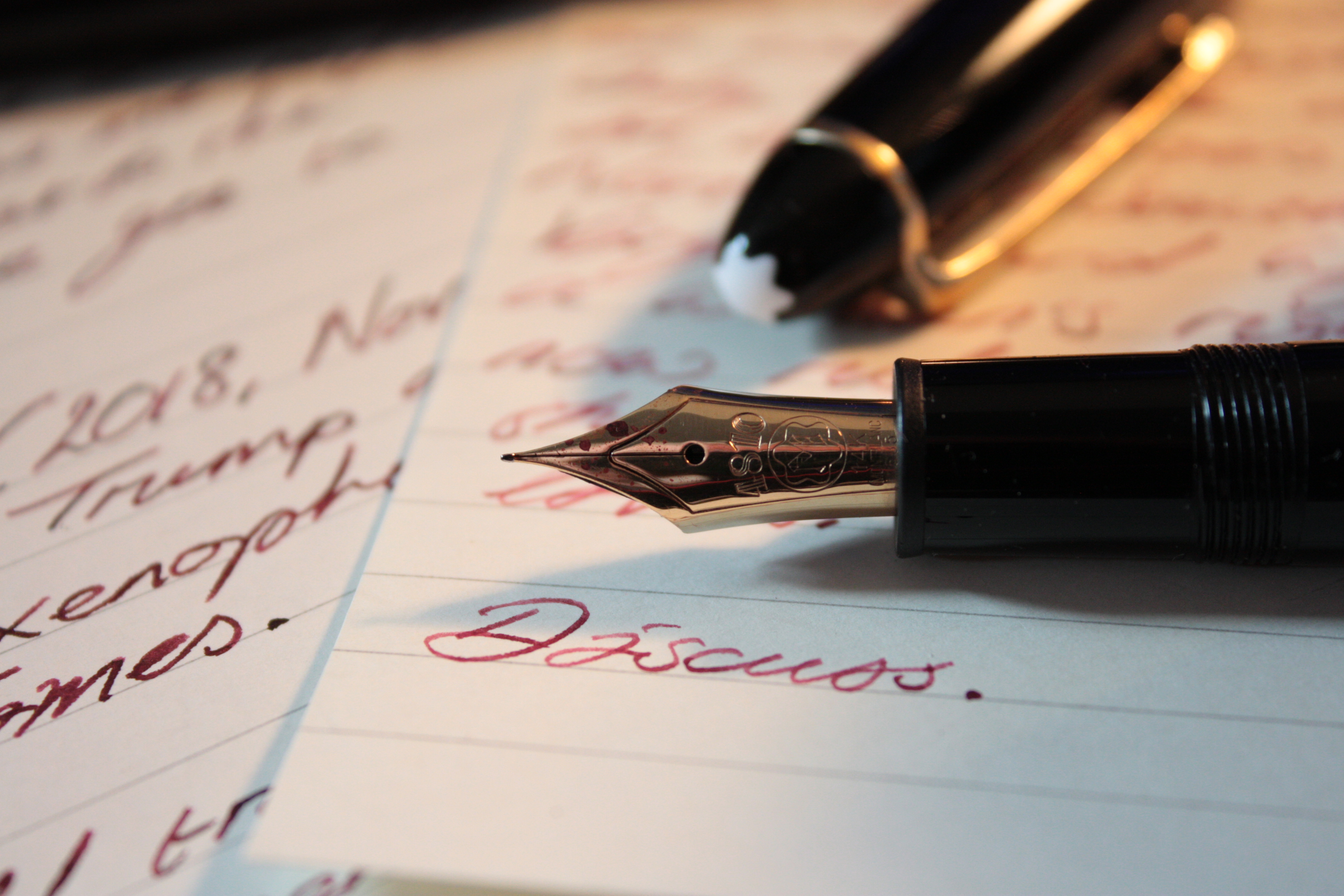
Truly spectacularly, each one. The XF on the 146 Le Grand has slightly more feedback than the medium on the 144 Classic—as you would expect—but even then, I’ve never written with an XF nib as smooth and well tuned as this one.
Summary
So there we have it, my unbridled consumerism far outweighs my socialist values when it comes to acquiring a beautiful new fountain pen… or two. In addition, I can’t quite put my finger on it, but the Montblancs I picked up from John Culmer’s online shop have that edge of quality and superiority that only comes with decades of elitist marketing and fancy boutique retailing… <dreamy, spooky voice> “Yes this pen really is better because it has a six-pointed snowflake on the cap, and you should definitely pay eleven hundred bucks for it.” Only you shouldn’t, not really, go visit an established, reliable, vintage pen supplier like John, and pick one up for almost four-hundred dollars less. They are beautiful, high-quality pens, that you simply won’t regret owning. Just ask my wife.

Thanks for this great piece, which I have enjoyed reading several times!
The superb reputation of Montblancs is the stuff of legend. There was a youtube video recently about the 30 or so processes of making the nib culminating in each one being tested for writing feel AND sound on paper, by a lady in a soundproofed room. To have no feedback as you write would be no good.
I am fortunate to have a lovely Montblanc Meisterstuck 12 from the 1960’s and a 146 from the 1970’s both of which have lovely broad nibs which are softer than the modern ones…except for the Heritage 1912 with its unique, soft, retractable nib. I bought a 145 in January (which is in my shirt pocket even as I type this). I dithered over whether to change the medium nib during the first 6 weeks but keot it in the end. Your EF nib sounds lovely. Also, I too havea bottle of Monteverde Napa Burgundy , a lovely ink except that it looks very similar to Montblanc Burgundy red, which I had already.
LikeLiked by 1 person
Thank you! Yes, I can believe Montblanc throw those sorts of resources at their nib manufacture. Few other companies could hope to. I can’t help but feel that I have opened up yet another branch of pen acquisition. And agreed on the ink… I have both, yet seem to return to the Monteverde more often than the Montblanc. It somehow seems to have more “strength” to it with the pens/nibs I use regularly. Thanks again for commenting!
LikeLiked by 1 person
I have some 100 bottles of inks from various brands. I last bought Ukiyo-e series of inks from Taccia. Unbelievably good inks bordering on the great. MB has good inks too but Pilot Iroshi Inks are a great act. Now this-Rusty Sabimidori,Ruri,Ume Murasaki have kinda floored me.
LikeLiked by 1 person
Great to hear Sunil, and thanks for posting! I’ve heard good things about Taccia inks, so I shall be looking out for some!
LikeLike
Thanks for the enjoyable article. Petty details on nib: 4810 is height of Montblanc in meters; 585 means 14k gold (14/24 = 0.585).
LikeLike
I’ve always wanted one, too, since I saw one in a case on my first trip to Europe.
The six pointed “snowflake” always makes me think of the top of a Smurf cake, however… or a bird dropping! 😀
I think it is adorable that you and your wife have a “set” of pens like that, too. They look lovely together. 😉 Couples should have interests in common, even if one of you is the greater enthusiast. Just don’t write with them while wearing matching outfits.
LikeLiked by 1 person
Love it! I can see Montblanc marketing hiring the two of us in a second… “Buy this pen, it only looks like it’s topped in bird s***!”
LikeLiked by 1 person
Pingback: Laban 325: Won’t Stop a Rhino – Writing
Pingback: The Laban 325: Won’t Stop a Rhino – Writing
Pingback: This week in faking the writing part – Writing