
When I write personal correspondence, I tend to write with either brown or blue ink on ivory or cream paper. Like I have said before, I like to color-match pens to inks, not least because it helps me pick the right color pen and ink on sight. I have blue pens with nibs I love, and I love just looking at them in my hand as I write. But I have not—until now—ever had a brown pen. Boring old fart that I am, brown, and tortoiseshell pens, with gold trim have always struck me as timelessly elegant, in the same manner as black and gold. Bright colors can be attractive I suppose, in the right circumstances, but on the whole, nah, they just don’t do it for me. Bright orange, vibrant stripes, or Hawaiian swirls, are just not up there with the simple class of my black and gold Platinum Century 3776, the Edison Collier in burnished gold, or my Sailor 1911L.
I suppose, given how much I like large pens, have loved my Edison Collier, grown to appreciate the TWSBI Diamond 580AL, I could have gone for another Edison… they definitely do some stunning designs that would have fitted the bill. But, as has been told elsewhere, I was going to be in Toronto, and that meant a brick and mortar store, and taking what was in stock on the day with no waiting for delivery (24-hours can be terrible). I was good with the whole whatever was in stock thing, because I had done a bit of research, and made some inquiries. Of the three major stationery shops in Toronto (Laywine’s, Take Note, and Wonder Pens), one of them had one of the key pens I was looking for in stock, and in the right nib size.
A note to all buyers here… do your research first. Have an idea of what you want to buy—brand/model/color/nib size, that sort of thing—and call ahead to see if the shop has a pen or two for you to try. Not all such specialist shops carry a huge inventory. At several hundred dollars a pen, a large stock list represents a lot of money tied up in pens they won’t sell very frequently; so smaller shops will often have to order an item for you.
In this case, the lovely Jolanta had a pen in stock, the right nib, and at a great price.

Jolanta Petrycka
2993 Dundas Street West
Toronto, ON M6P 1Z4
Tel. 1 416 766 1235
When I arrived, Jolanta wasn’t in the store on the day, but had left an equally helpful and lovely person in charge, by the name of tUkU. tUkU patiently took me through each and every one of the models I wanted to look at… Platinum, Sailor… 1911L in ivory, 1911 in orange and another in yellow, the Pro Gear Slim Special Edition Earth, 1911S… back to the Pro Gear… and back to the Pro Gear again and again (a few times over). tUkU sent me away with—as far as I could tell—the last Sailor Pro Gear Slim (also known as the Sailor Sapporo) Special Edition Earth to be found on sale in Toronto.
I’ve seen these pens still in stock on US retailer web sites like Anderson Pens, and Classic Pens, both for about $200 US ($257 CAD) before taxes and shipping; but I can’t find any other stock with Canadian dealers (2018-03-05).
So What’s So Special About The Earth Edition?
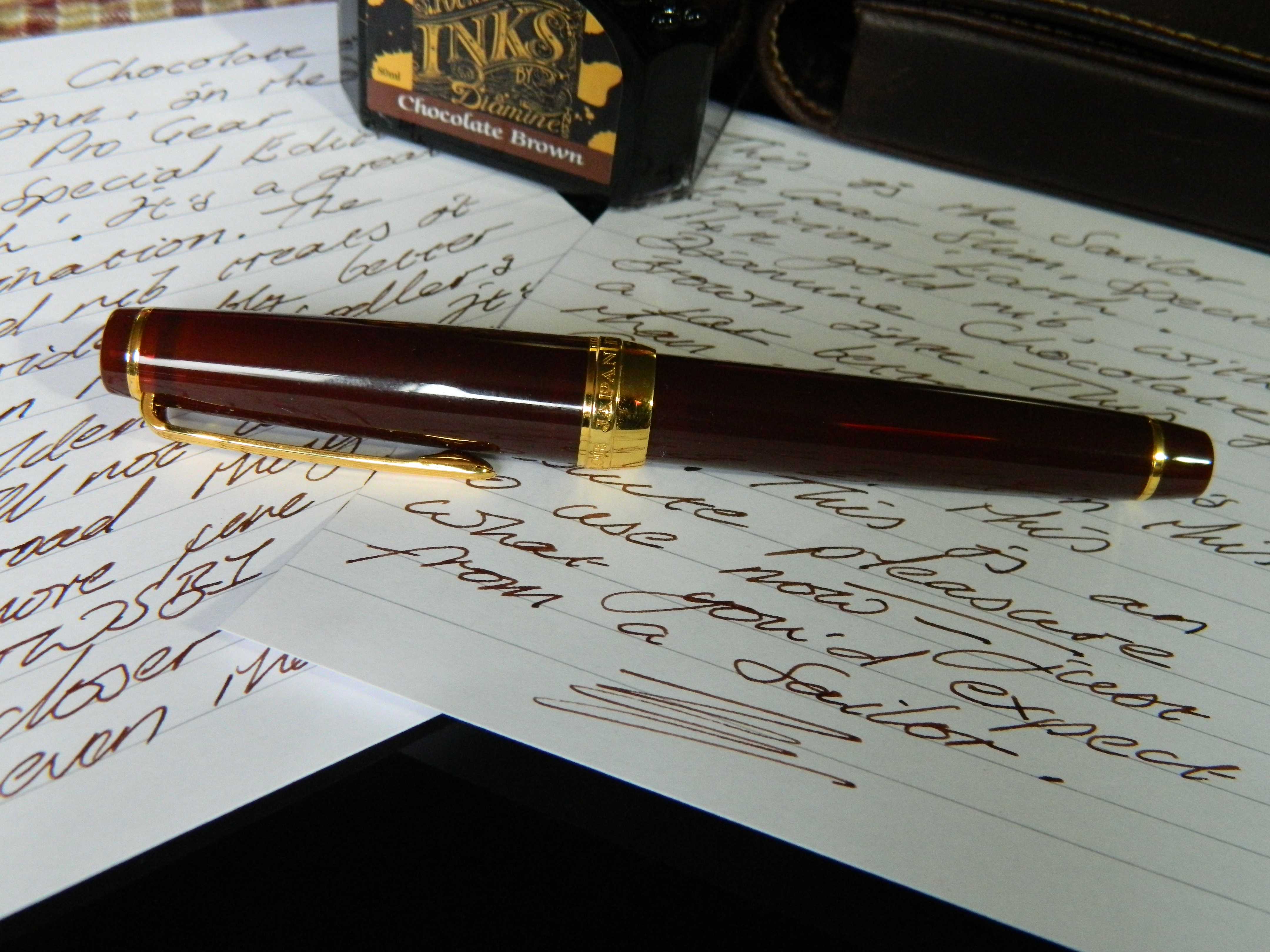
Like every Sailor I’ve ever used, this pen oozes quality and style. The finish of the acrylic ranges from the fairly solid brown along the barrel, to a warm, semi-translucent brown-with-red-undertones along the clip and the section. This semi-transparency is particularly pronounced in certain light conditions, and lends the pen an extra level of aesthetic appeal (as if that was even needed).
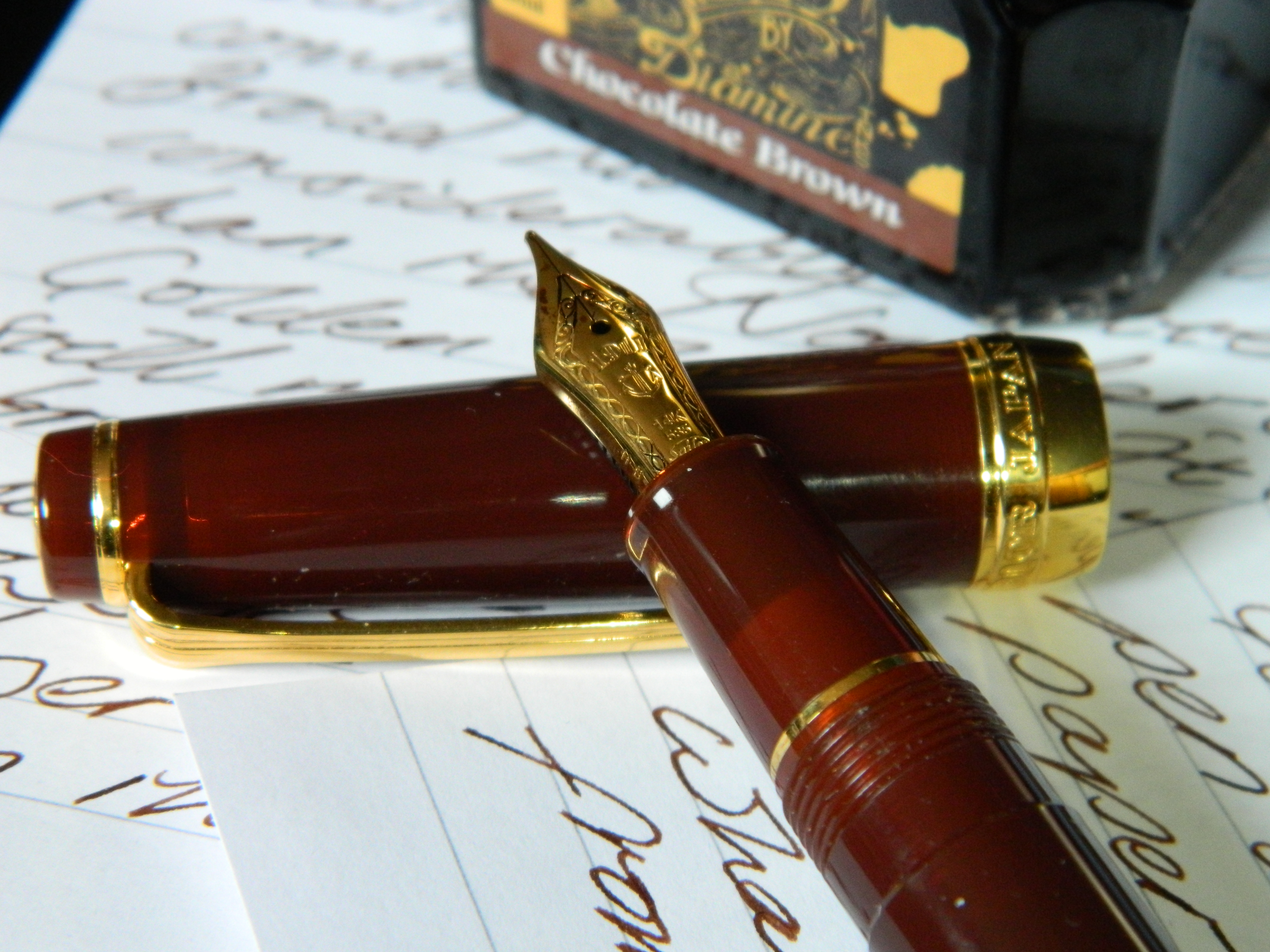
Gold fittings compliment the brown of the acrylic, with Sailor Japan Founded 1911 etched into the wide gold ring at the base of the cap.
The cap is subtly threaded, and can be easily and securely posted.
The Special Edition Earth is also available in the full version of the Pro Gear (the Classic), and—for a great deal more money—the King of Pen; both of which come with 21K gold nibs. Yes they’re bigger and better, yes they’re worth it, no there weren’t any to be had from anywhere.
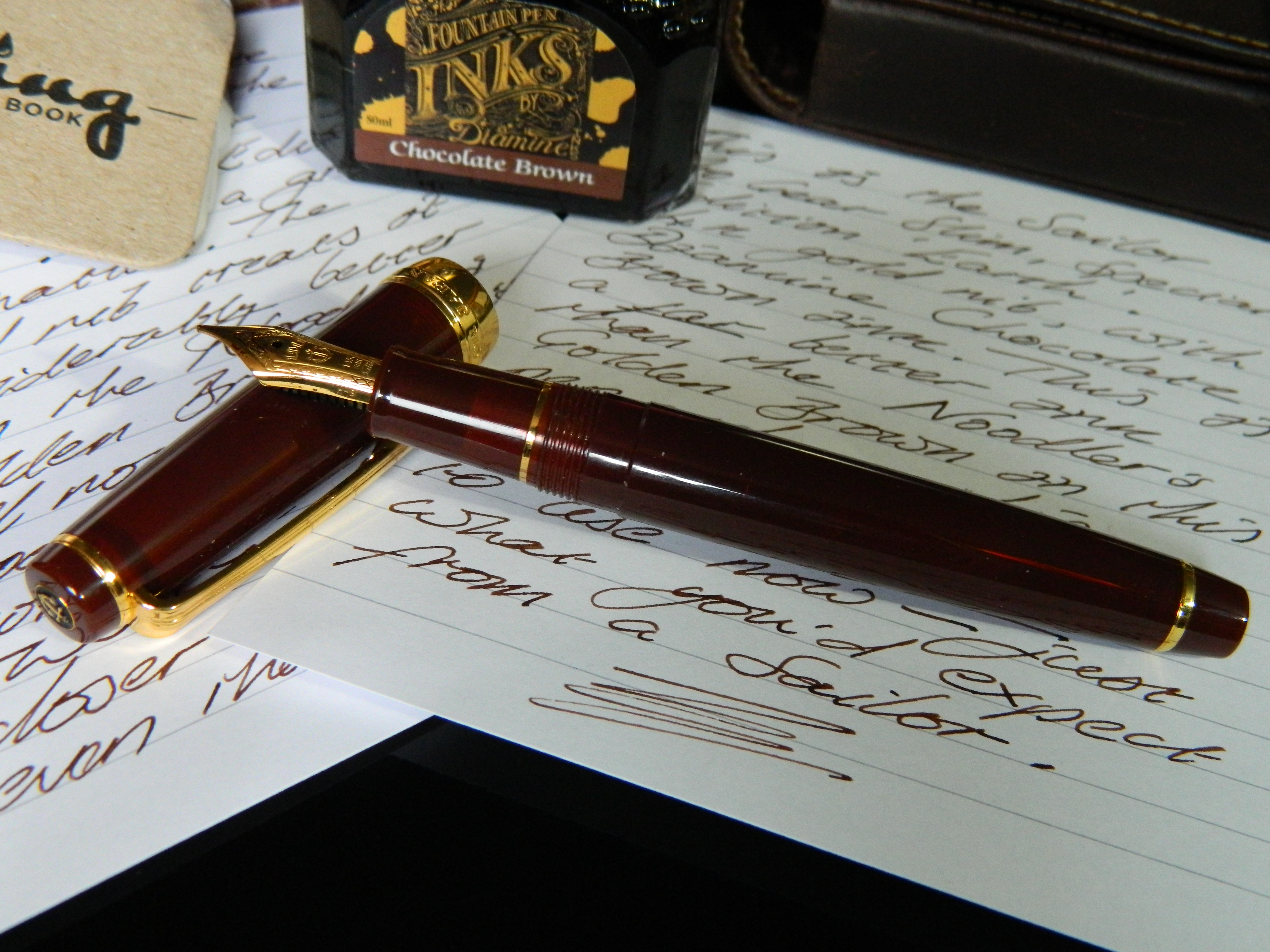
The Sapporo sports a 14K gold nib, which is still a thing of beauty in use and just to look at…

The cap and the finial are both squared off, with the top of the cap bearing the enamel anchor of the Sailor logo. I have to say, the squared-off ends of the Pro Gear do not appeal to me anywhere near as much as the rounded, tapering ends of the 1911L. In addition, squaring off both finials makes the 1911S particularly small, which again does not appeal to me as much as its larger sibling.
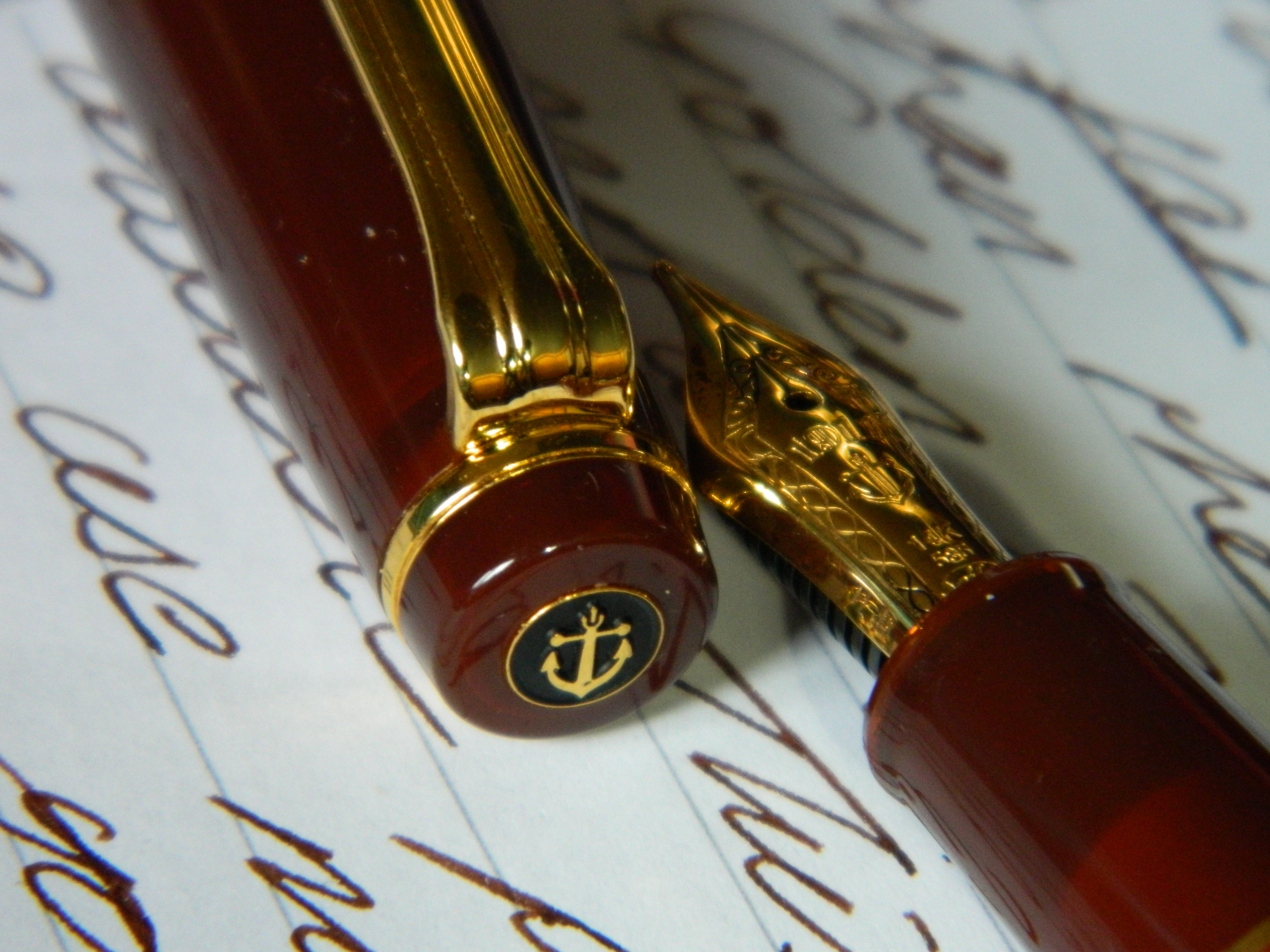
The other end of the cap bears the wide gold band, and the Sailor Japan inscription…

Details
The Sailor Sapporo is a small pen. I don’t like small pens very much, but I can so overlook that this time, and I can always post it if I get really frustrated. To give people an idea of just how small it is, I’ve listed its statistics alongside those of the full-size 1911L.
| Measurement |
Sailor 1911L/Classic |
Sailor 1911 |
||
|
mm/g/ml |
in/oz/fl. oz | mm/g/ml |
in/oz/fl. oz |
|
| Length Unposted |
122.50 |
4.82 | 111.00 |
4.37 |
| Length Capped |
139.70 |
5.50 | 124.00 |
4.88 |
| Diameter |
12.70 |
0.50 | 11.00 |
0.43 |
| Circumference |
39.90 |
1.57 | 34.56 |
1.36 |
| Length Posted |
152.40 |
6.00 | 14.30 |
0.56 |
| Weight |
23.70 |
0.80 | 18.00 |
0.61 |
| Cartridge Capacity |
0.9 |
0.03 | 0.9 |
0.03 |
| Converter Capacity |
0.5 |
0.02 | 0.5 |
0.02 |
I know it’s only 11.5mm shorter than the 1911L unposted, but that really can make a lot of difference to the feel of the pen in your hand. I have to be quite conscious of its size if I’m moving it around in my grip, yet like I’ve said, I’m willing to overlook that because it’s such a beautiful pen to look at and to use.
And of course, the Sapporo is almost $150 cheaper than the 1911L/Classic, and the King of Pen is in another financial league altogether. It was also the only model I could get. I might have gone for the Classic if it had been in stock anywhere, but I didn’t have that choice.
What Does It Write Like?
Well, I was a bit surprised when I got it home. In the shop, that Sailor nib had been everything I expect from a Sailor. Beautifully smooth, with just a bit of feedback to remind you that you’re touching the page. And that was just with dipping the nib in a bottle of Diamine something blue (I didn’t get the name). When I got home, the nib, feed and converter were rinsed out, and filled with Noodler’s Golden Brown—an ink that I had thought highly of… until now. The pen was dry, almost ink-starved, and came so very close to skipping; which is absolutely unheard of in my experience of the Sailor 1911 line.
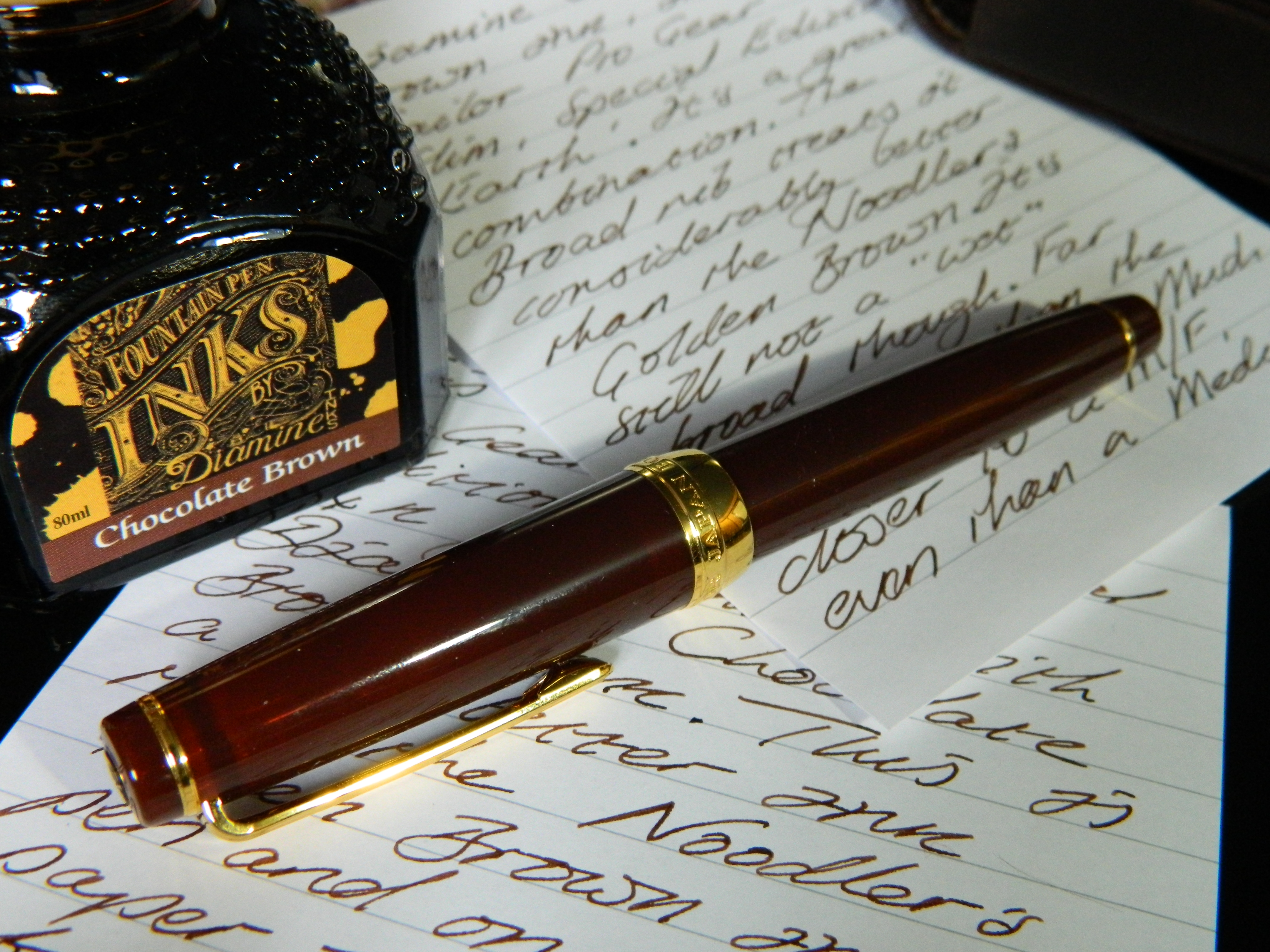
I changed the paper that I had been using. I know that the lined, white paper of the Clairefontaine Triomphe, 90gsm pad, I use for writing samples has a bit of a smooth coating that can be an issue for some nib/ink combinations. Changing the paper helped, but only a very little. I was about to reach for a brass sheet, just to slide through the tines and maybe encourage a bit more ink flow, when I thought I’d change the ink first. I flushed the pen once or twice, then pulled out my brand new bottle of Diamine Chocolate Brown, that I picked up at Wonder Pens the day after I got the Sapporo. And what a difference…

The rich, dark brown of the Diamine just flowed from that 14K Sailor nib across the Clairefontaine paper, almost exactly like a riot hose wouldn’t.
But you get the idea. It’s a pen, not a hose, all the same it flowed wonderfully.
This should not really have come as that much of a surprise. I remembered reading another review of the Sailor Pro Gear Special Edition Earth during my initial research, so I went digging around again to see what the reviewer had said about any ink issues. I found a review on The Pencilcase Blog, from about this time last year:
One thing I did notice, is that wetter, more lubricated inks perform noticeably better. Sailor’s own ink is a good example of a smooth, lubricated ink, and they work well with their pens (obviously). I don’t know if this is always the case, but there was definitely some noticeable difference between the inks I tried.
The Pencilcase Blog
Sailor Pro Gear Earth Fountain Pen Review
Monday, March 13, 2017
 Using Diamine’s Chocloate Brown, the 14K gold Sailor broad nib put down a nice solid line, no matter how fast I tried to write. The line itself seems to me to be even finer than Sailor’s usual Western medium, that they like to call a broad. You always expect a finer line from a Japanese nib than from a Western, but somehow this seemed even more so than usual… or maybe that’s just me.
Summary
No matter how small the pen is, it’s still a Sailor 1911.

And whether that’s a King of Pen, a 1911L, 1911S, Pro Gear Slim, Classic or Realo, being a Sailor-made-pen has always meant top-quality manufacture, a faultless nib, and an incredible writing experience.

This pen looks amazing, and writes even better than it looks. The color and shading in the translucent sections is fascinating. So it’s a bit small for me… I can post. So I’m not keen on the flattened finials… the badge looks nice.
Thanks again to Take Note in Toronto, and to tUkU in particular, I’m a very happy customer!

ZOMG. I’ve got one of these in the regular Professional Gear Size on the way. I won’t read your review before I get mine. But we’ll be almost like pen siblings if I keep mine. 🙂
LikeLiked by 1 person
You will keep it, I can almost guarantee it. Give it a nice wet ink and enjoy! Now I’m waiting to see what you think… this is as bad as waiting for a pen 😖
PS. I had to look up “ZOMG”—I thought, “what’s the ‘z’ for?” I am so old 🙁
LikeLiked by 1 person
Now you’ve gone and done it! I don’t normally like gold finishes on pens, but when I saw the bigger Pro Gear version of this one at a pen show I was prepared to make allowances. After a lot of debate I had just about persuaded myself to buy a Franklin Christoph instead of this. Now I’m not so sure…
Curses!
LikeLiked by 1 person
The Classic Pro Gear SE Earth, 21K Sailor nib, beautiful finish and workmanship vs. Franklin Christoph design, probably a custom Mike Masuyama nib grind… this is a tough choice. Glad I won’t have to make it! 🙂
LikeLiked by 1 person
Got it in one! In practice I want both (and will get both), but it’s which order to go for. The Sailor is a limited edition, but there’s one F-C finish that I like the look of, and by the time I’ve saved more cash it may well have dropped out of their rotation. The Masuyama medium stub looks like my kind of nib – custom fettled, with just enough variation to suit my (mostly) awful handwriting.
Decisions, decisions…
LikeLiked by 1 person
I so know the feeling… I think everybody that reads these blogs has bought that t-shirt at some time. Keep us all, er, posted, I can’t be the only one who wants to know how this is going to go down now.
LikeLiked by 1 person
Thanks for the sympathy. There should be a post or two in this, if nothing else – a chance to show my indecisiveness in action.
LikeLiked by 1 person
If you’re anything like me, you can make all the snap decisions you like, it’s the bank that has the final say 😦
LikeLiked by 1 person
Too true!
LikeLiked by 1 person
I have yet to drop by Take Note but now I want to even more! I can’t decide whether to get a sailor or a platinum as my next japanese pen at the moment ^_^;;
LikeLiked by 1 person
Take Note seem to have more Japanese stock than Wonder Pens at the moment, but of course, you can’t check Take Note out online. They’re definitely worth a visit though!
LikeLiked by 1 person
This one looks a real beauty! Great photos too. I am tempted by the Sailor Pro Gear and one of these days will have to put on my boating shoes and take the plunge.
LikeLiked by 1 person
It is a great pen, and although I am still overly conscious of its size, it’s one of my favorites already. I honestly don’t think you can go wrong buying anything in the 1911 range. For me, Sailor and Platinum are setting the bar for relatively affordable premium fountain pens at the moment. Very little touches the quality and value for money they offer in the Century 3776s and 1911s. I don’t think you’ll regret a Sailor Pro Gear purchase.
LikeLiked by 1 person
Pingback: Sailor 1911 Pro Gear Special Edition Earth… Simply Stunning – Writing