
On a recent trip around the studios and other arty places in our local area, and knowing my fondness for paper and ink, my wife returned bearing a gift…
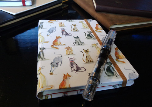
… from Peter Pauper Press, of White Plains, New York, a company I’ve not had any experience of before. The Cat Tales Journal is cute, with a capitol Cat. The photo’s here can’t do the covers justice. Each cat is slightly embossed on the thick, hardback cover. It’s an excellent design, and a cat lover’s dream. I wouldn’t even call myself a cat lover as such, but I love this little book.
The book is part of Peter Pauper’s Small Format Journal range, and contains 160 pages of good-quality, fountain pen-friendly paper. The size is about B6 (127mm x 177.8mm x 12.7mm; 5.00in x 7.00in x 0.50in), and the paper is a very slight off-white color, which appeals to me a great deal.
Line spacing is about 6.5mm, which is still very comfortable for large, scruffy, handwriting like mine.

When opened, the book sits nice and flat, which is something that I care a great deal about, especially with smaller journals; and is due (at least in part) to the high quality of the stitched binding:
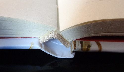
This is consistent throughout the book—tight, with no loose pages or substandard quality control; I very much like their attention to detail.
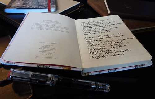
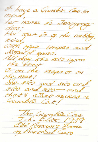
I couldn’t find any description of the grade of the paper anywhere online, or printed in the book. It feels fairly heavy, and if I had to guess, I would say 80gsm, but I wouldn’t like to bet a week’s salary on that. Whatever they use, it’s rather good. The paper doesn’t have the sheen to it of the glossy Clairefontaine, which means that rather fine nibs might catch a little, depending upon your ink or handwriting, but everything I used had no problems whatsoever. The black in the pictures above, was written using a Collier fountain pen with a 1.1mm stub, steel nib, and J. herbin Perle Noire black ink. This lays down quite a wet line, but there was no evidence of bleedthrough, or any substantial feathering as I wrote.
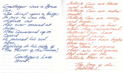
This sample was written with a TWSBI Eco, 1.1mm stub, steel nib, using Noodler’s Golden brown ink.
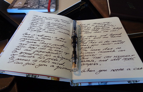
Both sides of the paper have been used, and you can see from the sample that bleed from the page behind is next to non-existent.
If you click on the scan for a larger image, you’ll be able to see that some feathering occurs, but it’s more than acceptable, and doesn’t interfere with the legibility of text in any way.
The next few writing samples put ink and nib combinations adjacent to each other for the sake of comparison.
I’ve tried to provide a variety of nib sizes and colors, so that you can get an idea of how well this paper supports a variety of pens and inks:
The left-hand, TWSBI Eco bold nib sample, backs onto the TWSBI Eco sample with the 1.1mm stub nib above. Even with these quite wet nib and ink combo’s, bleedthrough is not an issue.

For anybody that wants to know, the amazing Old Possum’s Book of Practical Cats, by T. S. Eliot, can be bought at the moment (in hardback) from Amazon for about $20.00 Canadian.
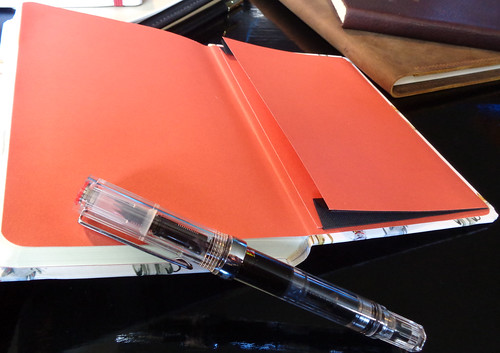
The front and back inside covers are lined with a rather striking terracotta-colored endsheet, which includes an expanding cover pocket in the back.
The elastic strap for holding the covers together (or a bookmark, as you fancy), runs neatly behind the rear cover pocket, and appears through two, small slits, on the outer back cover. It’s a nice, complimentary tan color, that the manufacturer’s call sandstone brown.
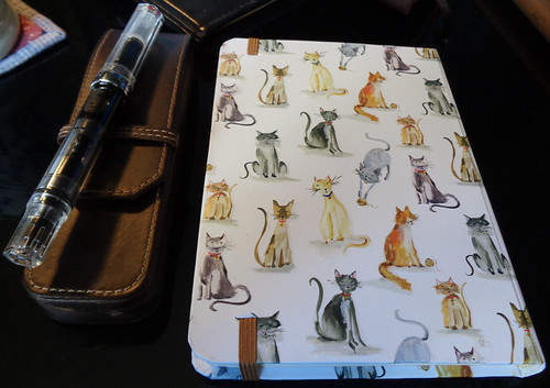
And lastly, let’s have a good look at the front and back covers, and their clowder of tabbies, toms, gingers, and kittens:

Summary
This is a great little notebook; good quality throughout, excellent, fountain pen-friendly paper, sturdy binding, a tough, matte, hardcover, that will appeal to cat lovers and tolerators alike. It has some nice features, and an attention to detail that I’m more accustomed to seeing on journals that are twice the price, or more.
If you see one, pick one up for the cat lover you know, or just to slip in your bag. It may not be the thing for stuffy office meetings, but it’ll make somebody smile, and what’s better than that?
Addendum
After posting this, I noticed the Peter Pauper Press also do a matching 2018 Cat Tales Weekly Planner, with the same embossed cover design. How cool is that?

Pingback: This week in faking the writing part – Writing
I picked up a Peter Pauper press journal on a whim from Chapters, and I was amazed at how great the paper is. I even did a heavily saturated watercolour painting on the first page and it held up better than most of my actual watercolour pads. I am heartbroken that they don’t do page-a-day journals, because I am always looking for something that is fountain-pen friendly. This year I am using a Moleskine for my daily journal and that is ballpoint only. Fountain pens look weird and awful and bleed through bad on a Moleskine, as any pen and paper nerd knows.
LikeLike
Absolutely! I’m a big fan of the Peter Pauper Press product line. Their designs, their paper, and their manufacturing quality have always been top quality. Moleskine? Not. I don’t touch Moleskine. Ever.
And thanks for commenting!
LikeLike